It is interesting that the sounds emitted by certain birds to establish territory and mating intentions are perceived by humans across different cultures as song. If they were named holler-birds instead I wonder if poets like Keats and Shelley still would have exalted the late-night shouting of a nightingale and the early wake-up calls of a skylark.
In any case, they are called songbirds, whose melodious chirps have inspired a many pieces of poetry and music; songs have been written about the singing of blackbirds, bluebirds, robins, larks and nightingales. Music really is universal.
The first bird I chose for my Songbird series of ACEOs was the Common Nightingale, appearing in thousands of poems since ancient Greece as a bird of love, night, spring and mourning. In Ovid’s retelling of a myth, the princess Philomela (Greek word for nightingale) is violated by her sister’s husband Tereus, who then cuts out her tongue to prevent her from speaking and locks her in a cottage. The story gets even more violent, so let’s skip to the end – she escapes by turning into a nightingale. Thereafter, Philomela sings of her tragedy as this songbird of the night. Learning this story give me greater appreciation for one my favorite songs “Nightingale” by The Reign of Kindo. The narrator in the song laments how he must watch his love go away with another man after he is left paralyzed from a car accident – if he could “muster a sound, [he’d] sing these words out loud/ Like a nightingale.”
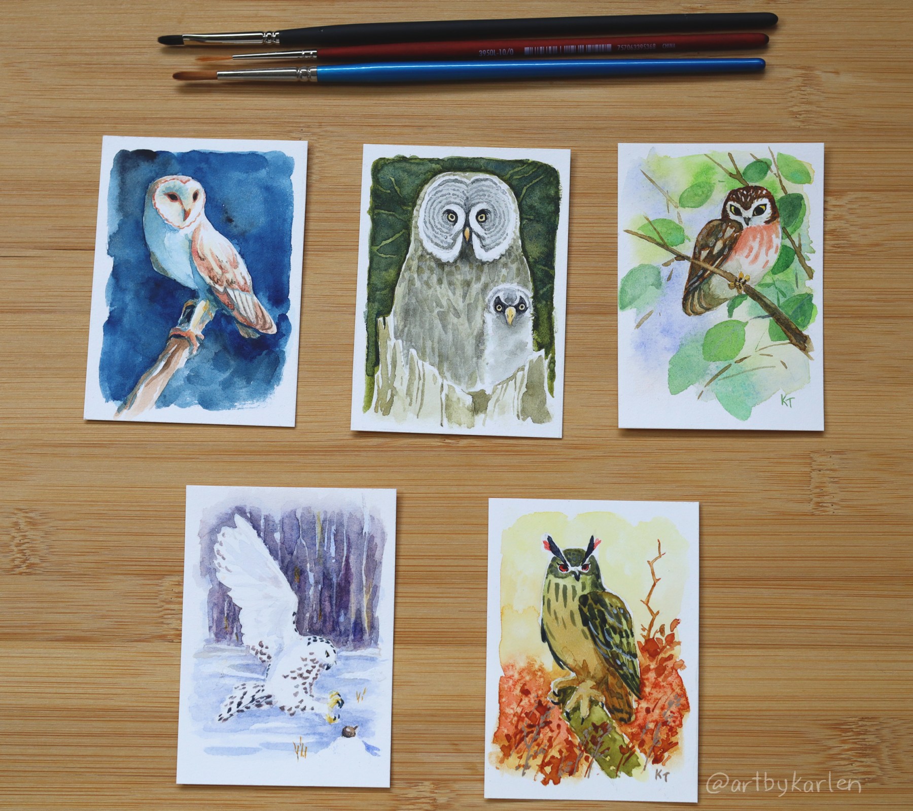
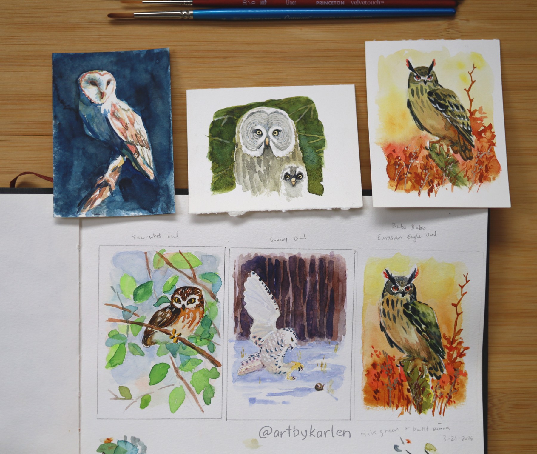
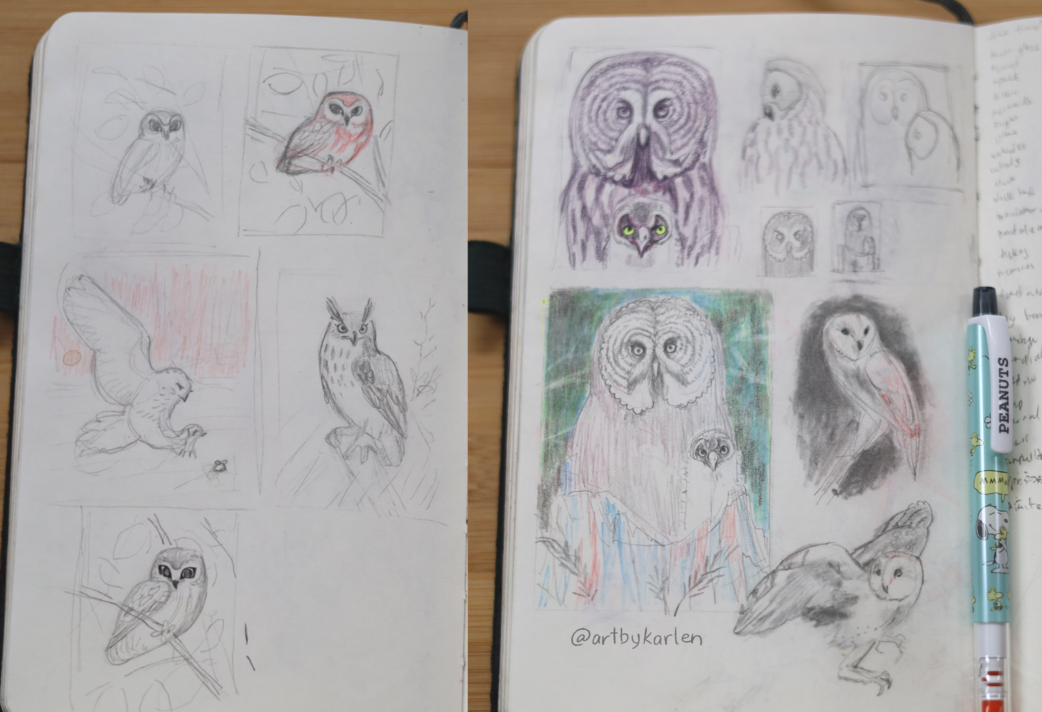
My favorite part of making these bird cards is reading the stories they inspire. But here is the artwork:


I always start with sketches and color tests. I worked on the Superb Lyrebird alongside the Nightingale, and learned some fascinating facts about the Lyrebird too!

Choosing only five was difficult because there are a few thousand species of songbirds – there’s a nice sketch of a Red-Winged Blackbird that I was reluctant to abandon. The other birds I painted are the Eastern Meadowlark, the Red-Whiskered Bulbul and Hermit Thrush.


The Hermit Thrush is also known as the American Nightingale (the Common Nightingale is native to Europe), whose myth is the perfect way to conclude the songbird series. I had to trim down the story to fit on the card but since we have more space here:
The Oneida people tell us that long ago, the birds had no song; only humans had this gift. Each day the birds would stop to listen as the humans sang a beautiful song of greeting to the sun as it rose and one of farewell as it set. The Creator noticed this and decided that the birds should have this gift as well. He called all the birds to a great council and instructed them on how to receive their individual songs. The Creator told them that the next day, they should all fly upward as far as they can. At the limit of their flight is where each will find their own song, and the bird to attain the highest flight would receive the most beautiful one. All were excited except for the little brown thrush – he looked at the eagle and despaired, for he had no chance to compete with such a large bird. While the eagle was distracted, the thrush buried himself inside the eagle’s feathers. The birds began their flight at dawn and filled the skies. As they tired and returned to the earth, they each learned their songs. The hummingbird was the first to fall out of the race. Eventually only the eagle was left, and as he started to turn back, the little thrush jumped out of his feathers and continued to ascend. The eagle saw what had happened but was too exhausted to stop him. The little thrush flew until he came to a hole in the sky and entered the Land of Happy Spirits. He stayed there and learned the most beautiful song. Eager to return and show it off, the little thrush flew back to the council rock. As he approached, he saw the eagle and the other birds glaring at him. Unable to face them, the thrush flew off into the deep woods and hid, wishing never to be seen. However, he could not refrain from singing his song from the Spirit World. When he does, all the other birds fall silent to listen to the song that causes the sun to shine upon the hearts of those entering the dark forest.

This will be the last set of bird cards for a little while, since I sent these out to Snail Mail members for May and June. I will be adding all Bird Art Cards to my Ko-fi shop very soon and finding frames for the originals – so don’t forget to subscribe for updates. I recorded processes of these all paintings that you can watch on my Instagram (I am still in the process of editing the footage).

Here is the great song Nightingale by The Reign of Kindo. You’re welcome!