A Parliament of Owls

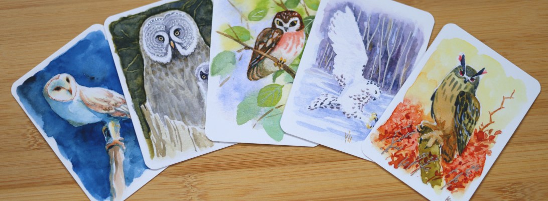
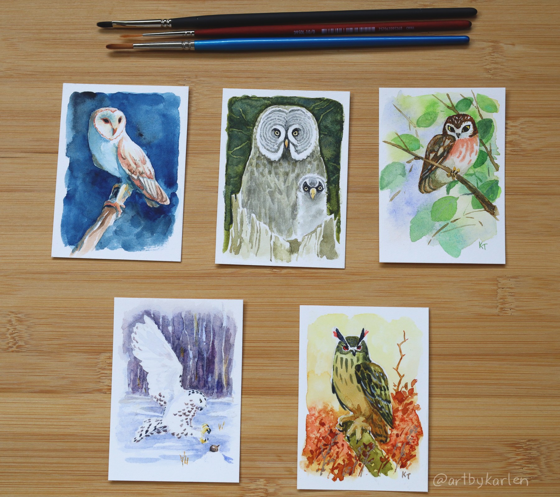
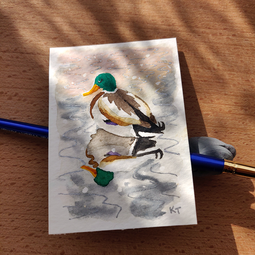
Following the ACEO series of winter birds I started last year, I completed another set of art cards featuring owls. Collectively, a group of these birds is called a hoot, or a parliament of owls.

Owls have fascinated and frightened people for centuries – because most of them are nocturnal they were associated with the supernatural. It was common superstition in the olden days that an owl landing on your house was an omen of imminent death. Nowadays, many people see owls as symbols of wisdom and great knowledge. There is so much folklore surrounding owls across different cultures, some of which pertain even to specific species.

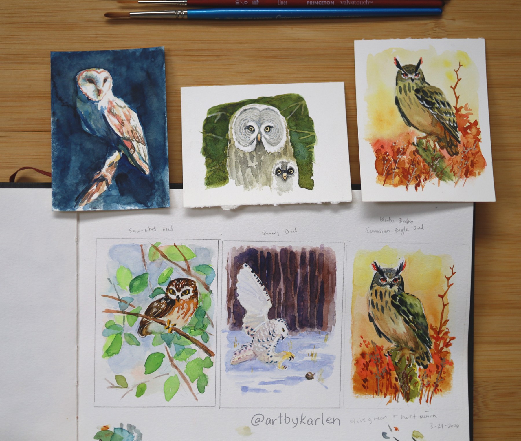
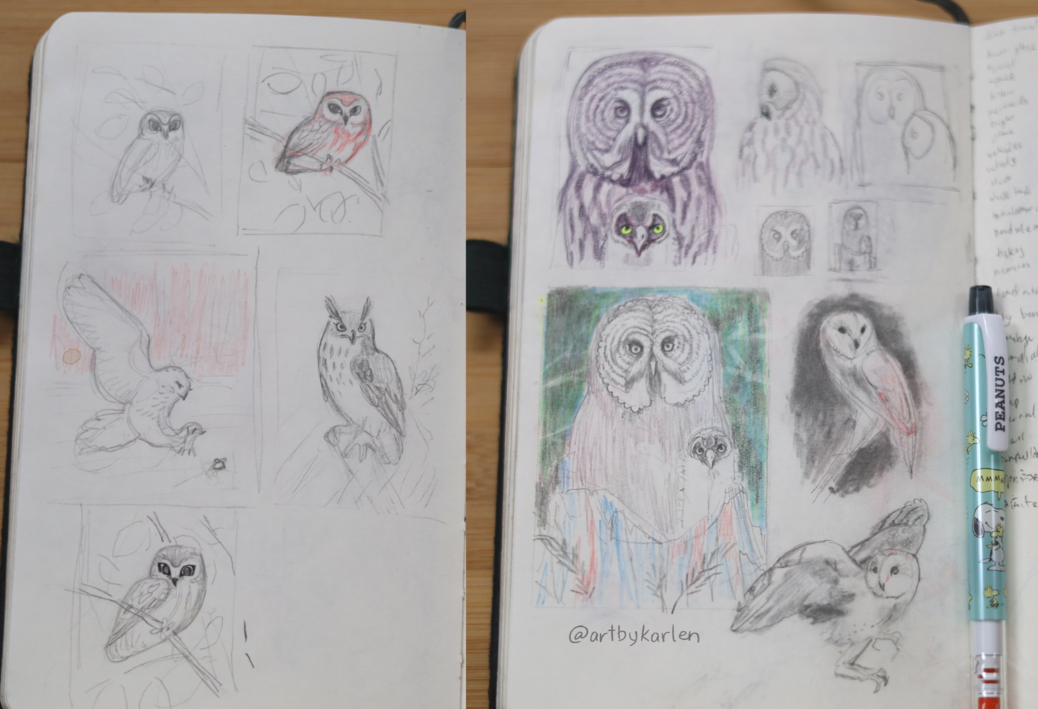
To chose five species to illustrate this for this series, I picked ones that were visually distinct, and planned for each painting to have a different color scheme so that the entire set displayed well together. Owls camouflage with their environment so their feathers are just varying degrees of grey, white or brown. Therefore, I had to invent more vibrant versions of them while keeping the colors feeling natural. Here are some preparatory sketches and paintings.

The most difficult part of each painting were the eyes – inaccurate brushstrokes on their avian eyeliner or an off-center pupil made the owl look goofy. These paintings are 2.5″ x 3.5″, so their eyes were tiny – which is why I practiced painting the Eurasian Eagle Owl twice before doing the real one – black and white eye makeup and eyebrows!

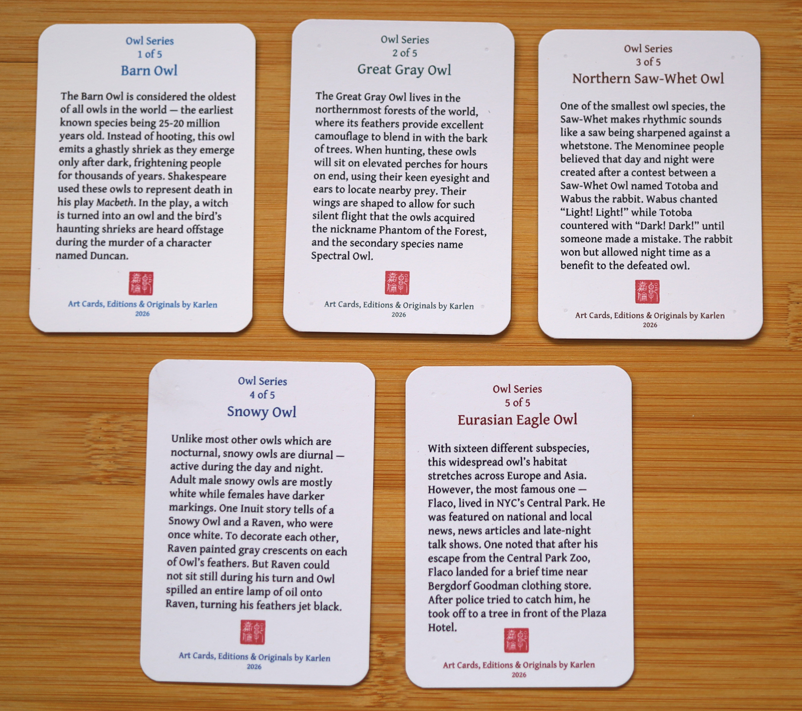
Next came the task of researching and writing the short pieces of fact and folklore for the backs of the printed cards. My favorites are Duncan and Flaco.

The whole point of making these art cards is to share my artwork in a portable physical format, so I sent out these Owl cards to my Snail Mail Club members. For the next series I am planning to do songbirds. You can learn more about the monthly subscription below:

For the first time ever, I brought my bird art cards to the public at a local market event. I was so happy to see that they made people smile and that the extra writing on the back of the cards were appreciated as well.

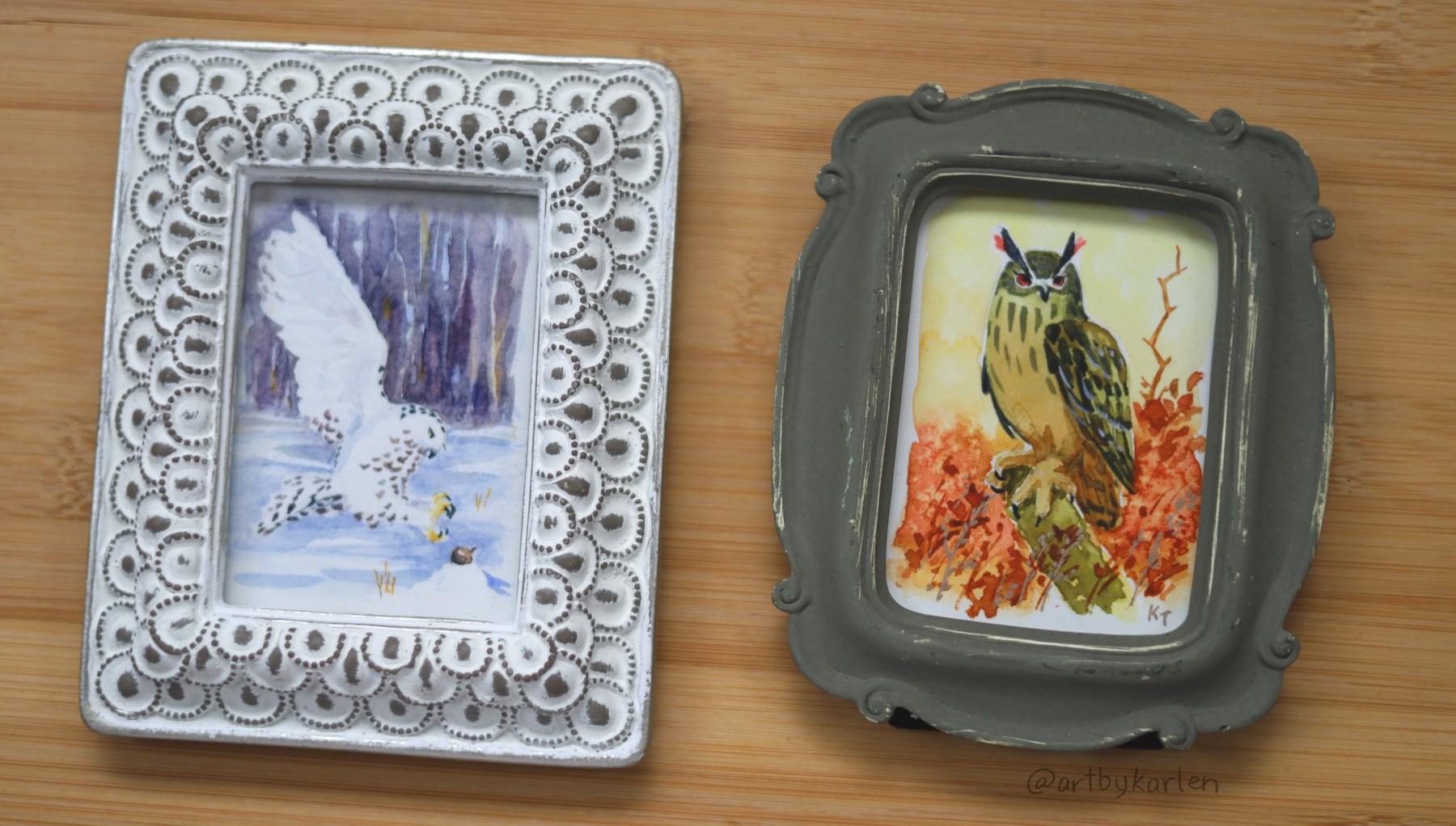
Framed artwork of the Snowy Owl and Eurasian Eagle Owl
These two owl originals flew off to new art collectors at the Buffalo Makers and Shakers Easter Market.

Thank you to the folks who brought pieces home and also to you for being part of this newsletter.

I would love to know which is your favorite owl or if it’s one that I slept on (in case I decide to make another hoot of owls in the future)!

Choir of Birds

I got my Christmas artwork done early for the first time ever ~ hurray! In the many years I’ve been making holiday cards, it seems to get harder each time to come up with a new idea without being kitsch or trite. As I write and reflect on my process, I realize new experiences and new memories are made throughout the year, which get added to the well of ideas to draw from; coming up with something didn’t end up being that hard after all. The bottom line for me is always this: tell a story.

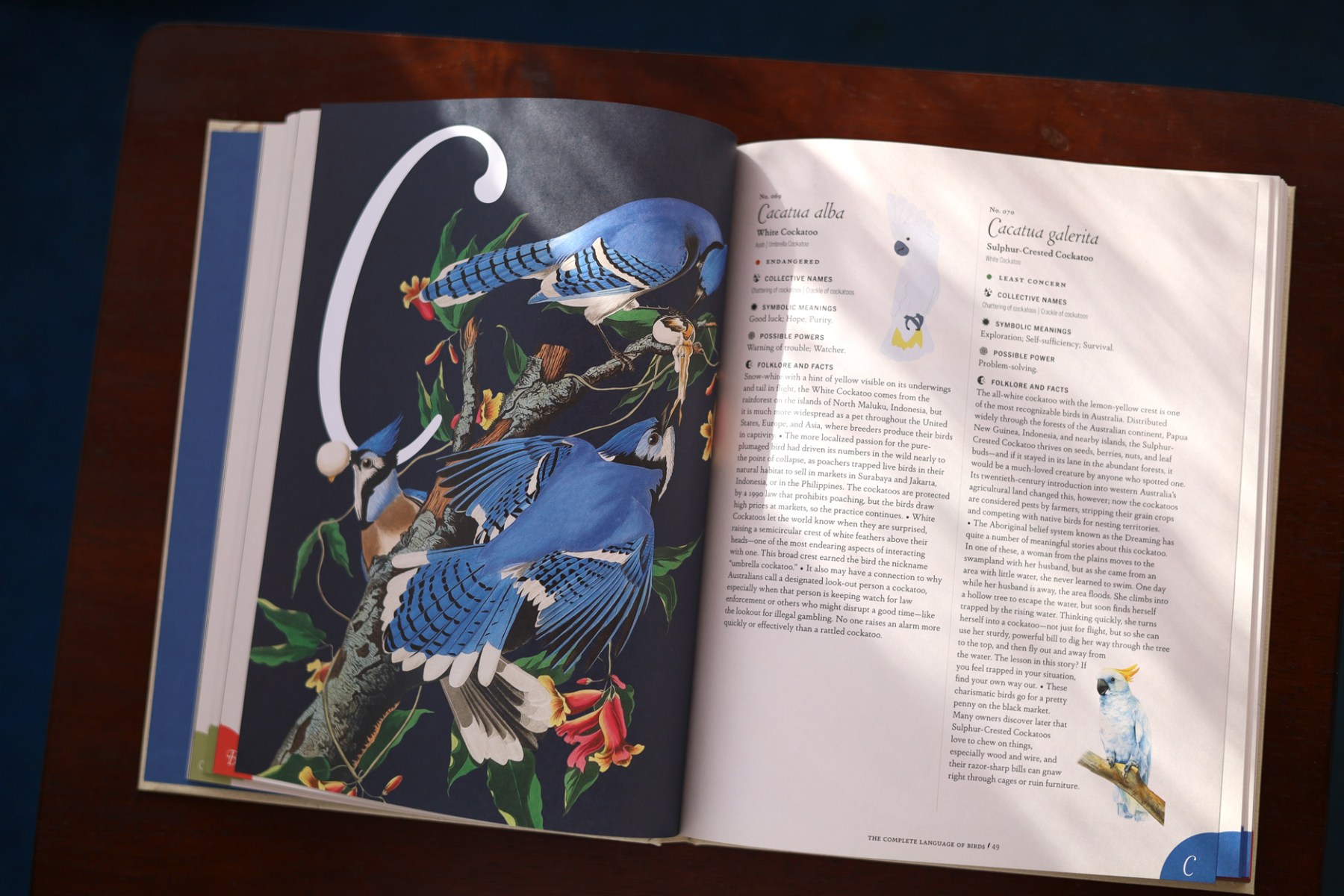
Recently while browsing the book section at a store, this book called out to me: The Complete Language of Birds by Randi Minetor. It’s an illustrated compendium containing hundreds of bird species with facts and folklore associated with each – 100% my jam. It was also the last copy there so of course I brought it home.

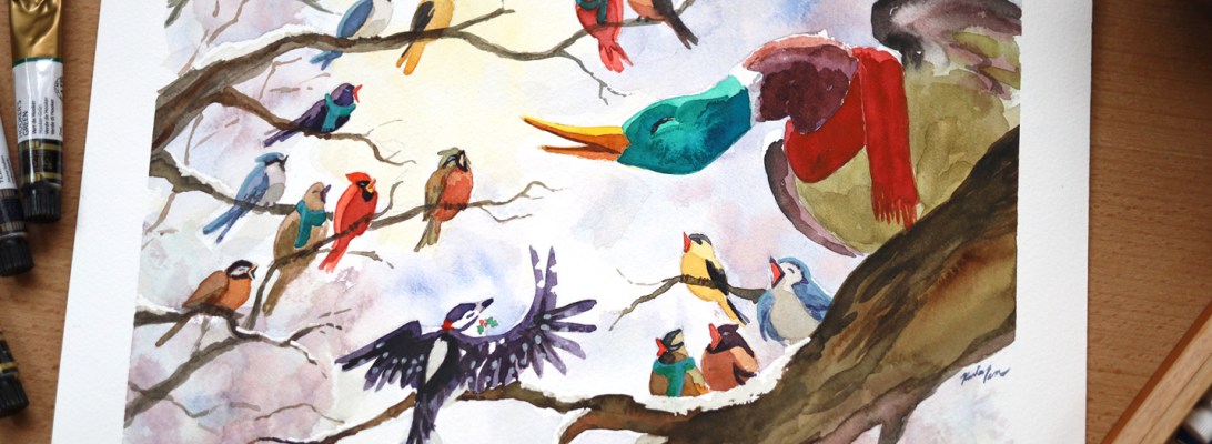
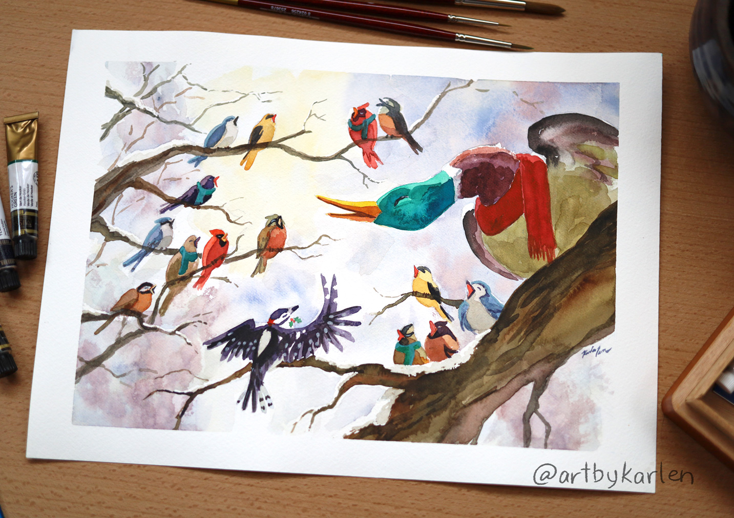
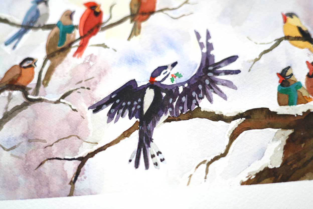
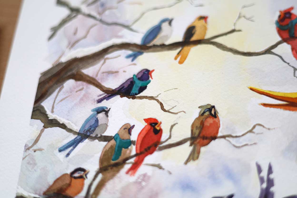
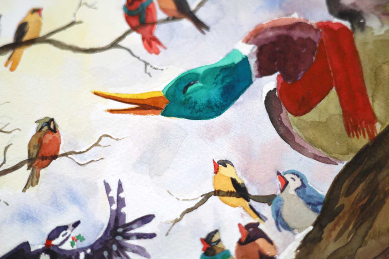
I leave this book around the house and would read about a random bird whenever the fancy strikes. As I was brainstorming ideas for the Christmas card, I thought of recent conversations with friends about our respective individualities, and hatched this idea: a choir made up of birds – and amongst them, a duck. I specifically chose wintering birds as I thought how each of these plucky birds with their unique traits and behaviors are able to thrive in the cold harsh weather. Ducks actually lay in the snow to keep warm! With a downy woodpecker to keep time, wouldn’t all of their different voices make the most wonderful choir?

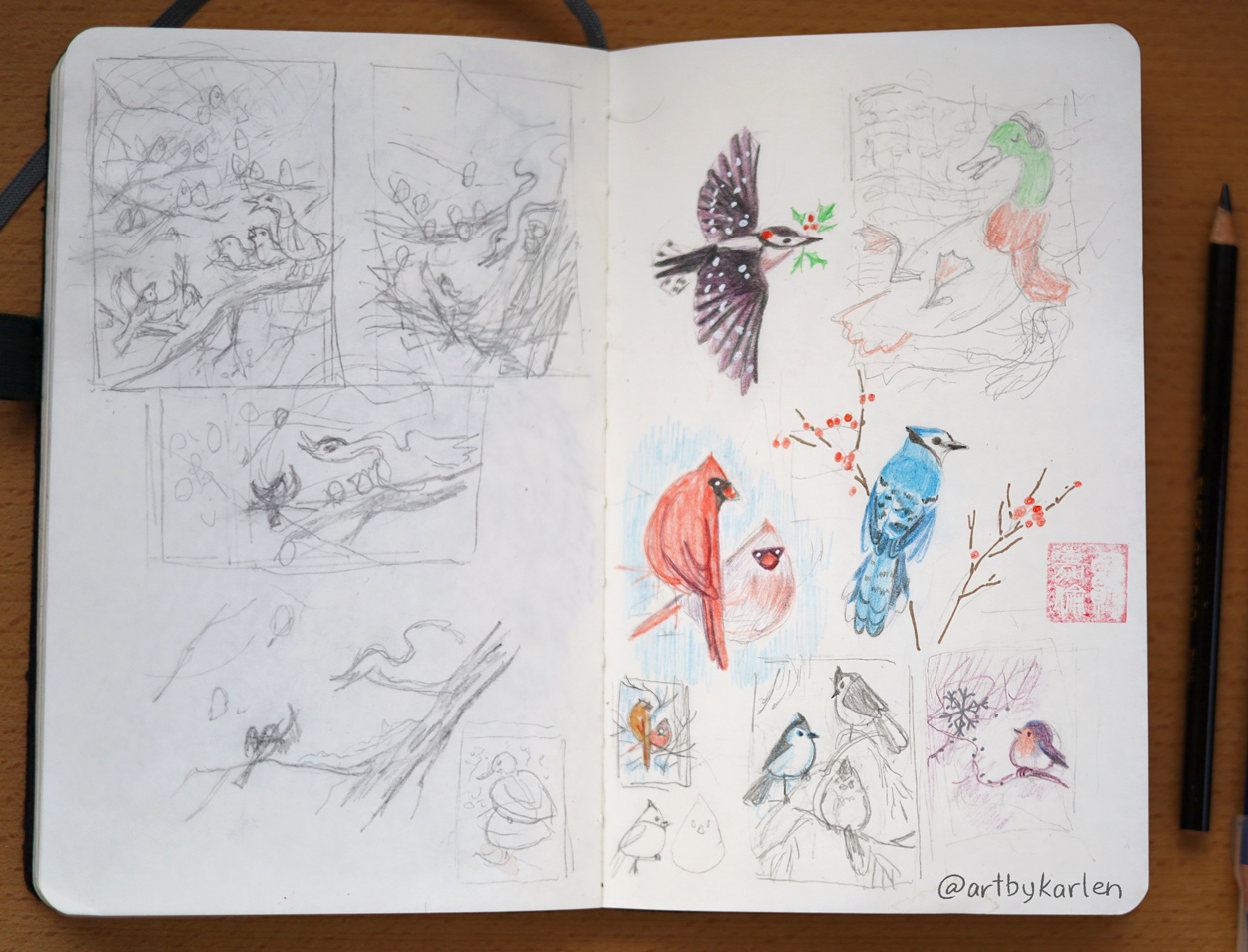
This spread from my sketchbook shows my chicken scratches of the concept as well as a series of smaller illustrations that followed.

At first I had the idea that the birds next to the mallard would side-eye him in annoyance for being too ducky. But no – I decided he too, is as sonorous as the best of them. Hence that graceful swoop of the neck as he quacks out his lines.

Below is the final 9″ x 12″ illustration done on Fabriano Artistico Cold Press cotton paper. The sponge effects didn’t show up well since I am not as used to this paper, but that may have worked out for the best since too much texture in the background would have been distracting.

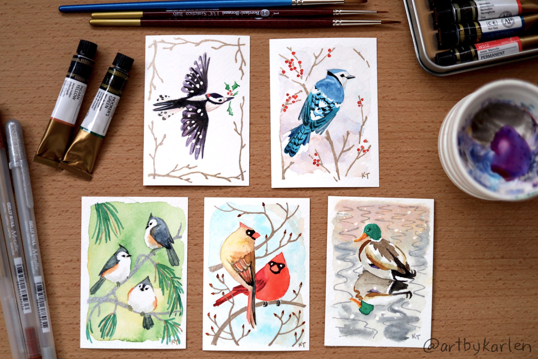
Completing this piece gave me some momentum so I did a series of ACEOs, which stands for Art Cards, Editions and Originals. ACEOs stemmed off of Artist Trading Cards (ATCs), an idea developed by artist M.Vänçi Stirnemann in 1997. ATCs are meant be traded or given away so another artist Lisa Luree started the ACEO group on eBay to make cards available to collectors. The size of ATCs are based on sports trading cards and may be made with any media as long as they measure 2-1/2″ x 3-1/2″.

I made my first art cards as watercolor commissions at trade shows 15 years ago and decided to pick that up again when a co-worker mentioned that ATCs were making a resurgence. Then again, who really needs an excuse to make their own Pokémon cards? One of my commissions back then was actually a Snorlax!

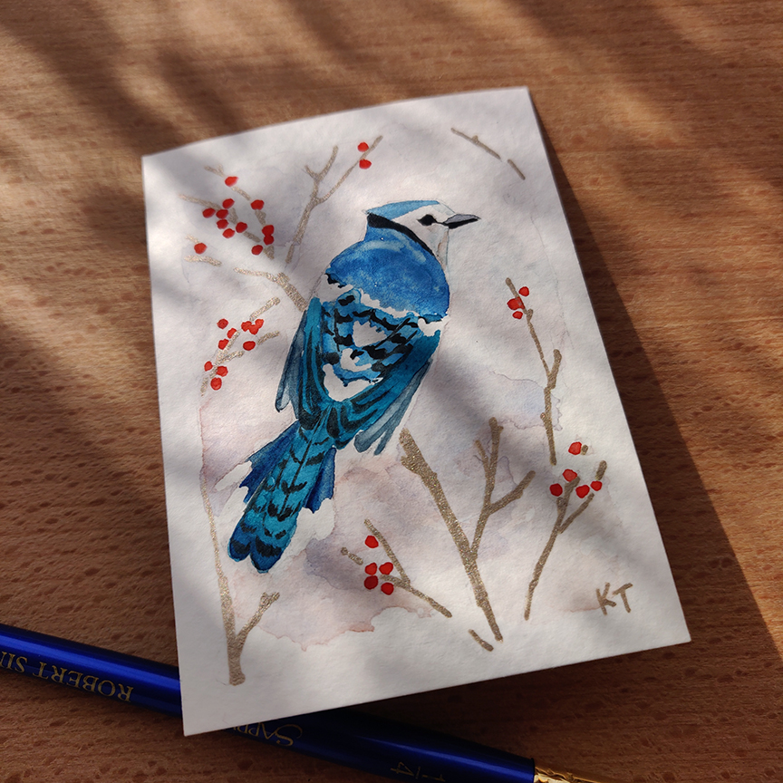
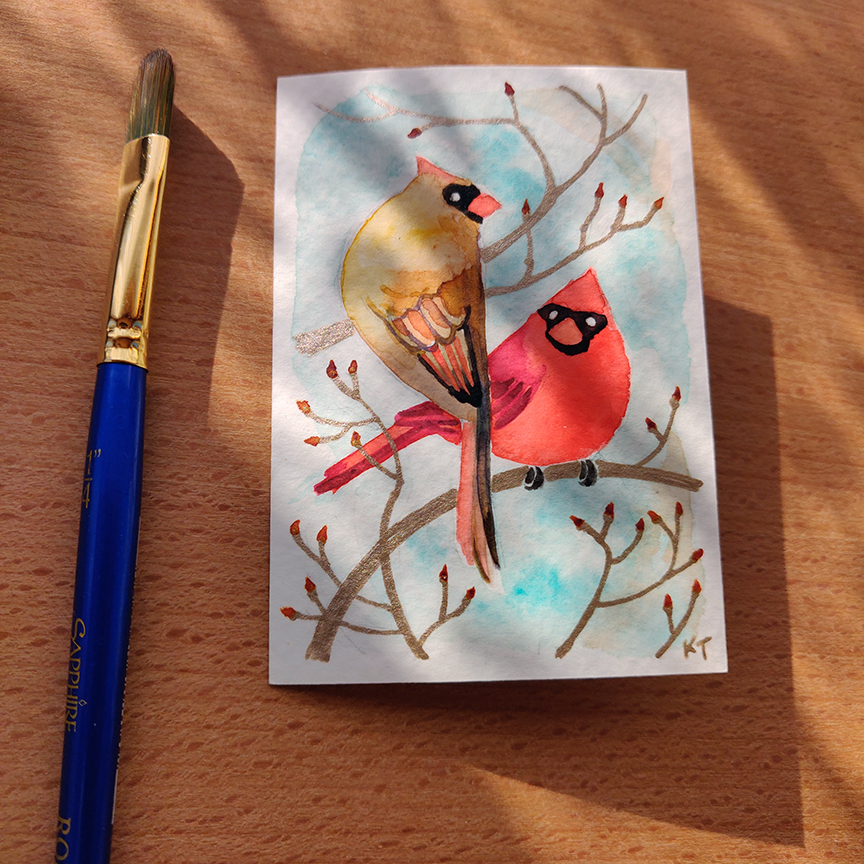
In the upcoming weeks I will be making a limited run of prints of my winter bird ACEOs, hand-embellished with the sparkly metallic ink as on the originals. As I think about the design on back side of the cards, it might be fun to share the folklore associated with these five birds that I learned from my book.

The finished pieces of artwork here are all available for purchase and I have set up a shop page for them. This is the first time I’m making my original physical pieces for sale online, so my website lacks full functionality as a store; I do not have an “Add to Cart” button, so to purchase multiple pieces, please send me a message so I can make an invoice for you with combined shipping.

A thousand thanks for your support and for reading! As always feel free to reply – the “donotreply” @ the top is lying.

A girl and her chickens

I’ve been going back to basics and learning to draw human anatomy (painting portraits is also part of the practice). That means learning which bones go where, which muscles go between and over them and how they squash and stretch depending on the pose. The drawings aren’t nice to look at but the process of doing them helps me understand and remember. Maybe I’ll show them if and when they actually look good.

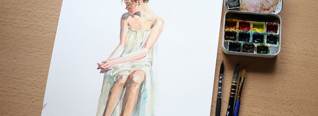
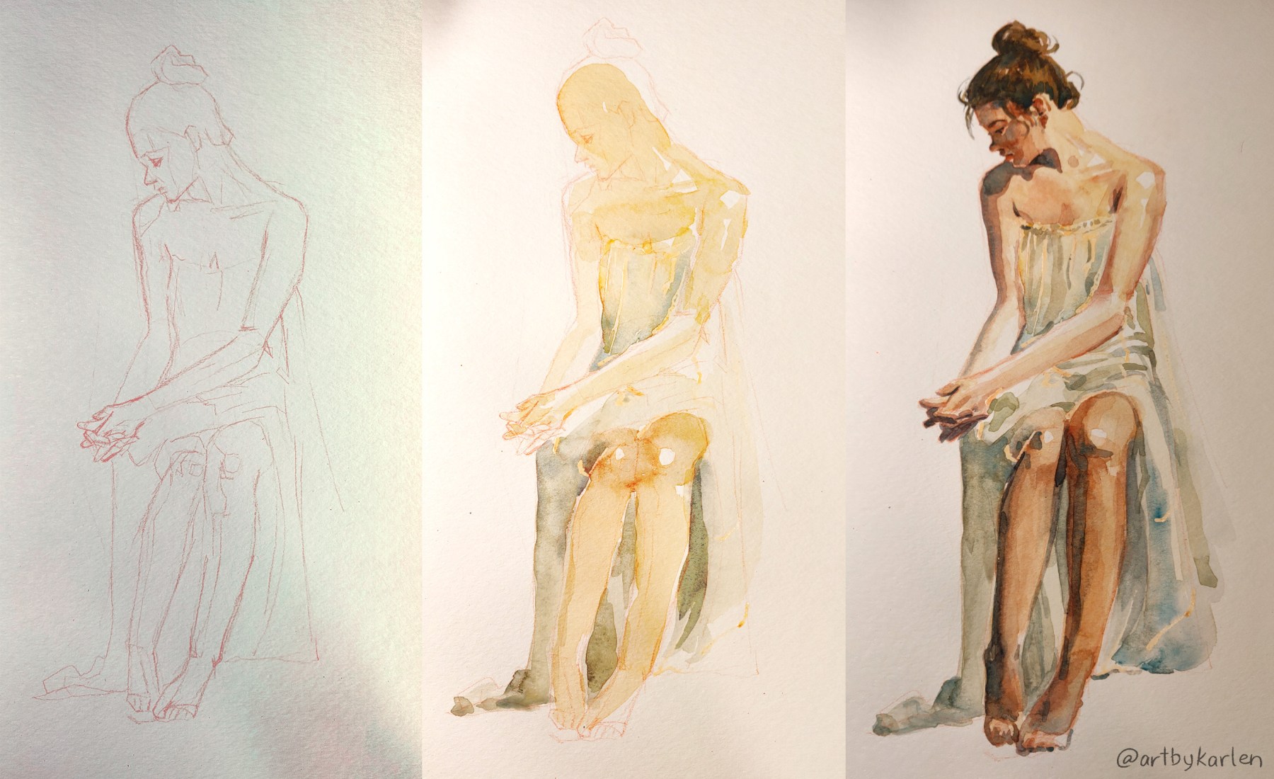
But I’ve been neglecting my watercolors so I remedied that with a figure drawing and painting over it. I got some new masking fluid (a.k.a frisket) on a whim at the art supply store but had awful experiences with it so I did some research before trying again. The internet suggested using an embossing tool (basically a metal stick with a tiny ball on the end) for application, so I found a new gel pen that still had the rubber covering over the tip in my drawer and it worked perfectly. It’s the light orange stuff on the drapery. It should be brighter and be more visible on the paper but the bottle I got was sitting on the store shelf for a while so the tint was stuck at the bottom and didn’t disperse even after much vigorous shaking.

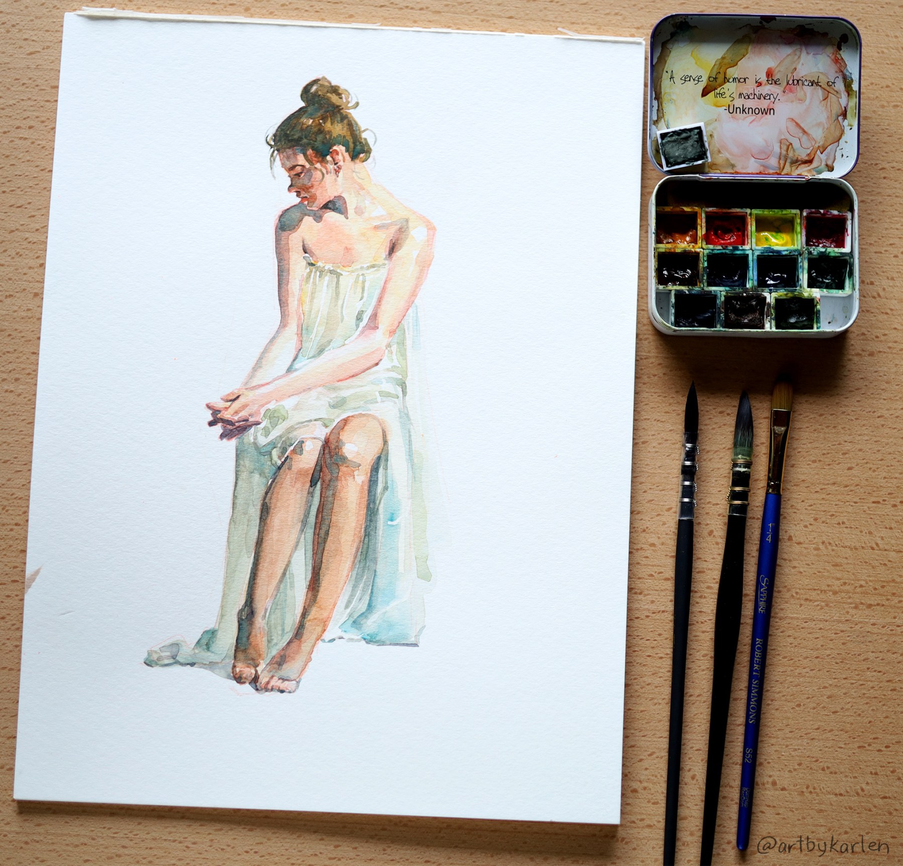
Pardon the lighting – I was drawing/painting at night and lamps don’t play nice with the phone camera. I did the sketch in red pencil and edited for visibility but the drawing is very faint in real life. But here’s the finished painting under daylight to see the actual colors. I usually prefer not to use frisket because the edges created by masking are too harsh but it worked well with light values here. I also softened them a tad with the lightest dab of a wet brush.

I’m pretty happy with how this came out and also surprised how soft the painting looks compared to the very angular drawing. Even though this study was done with a photo reference, it helped so much to know what bones are underneath.


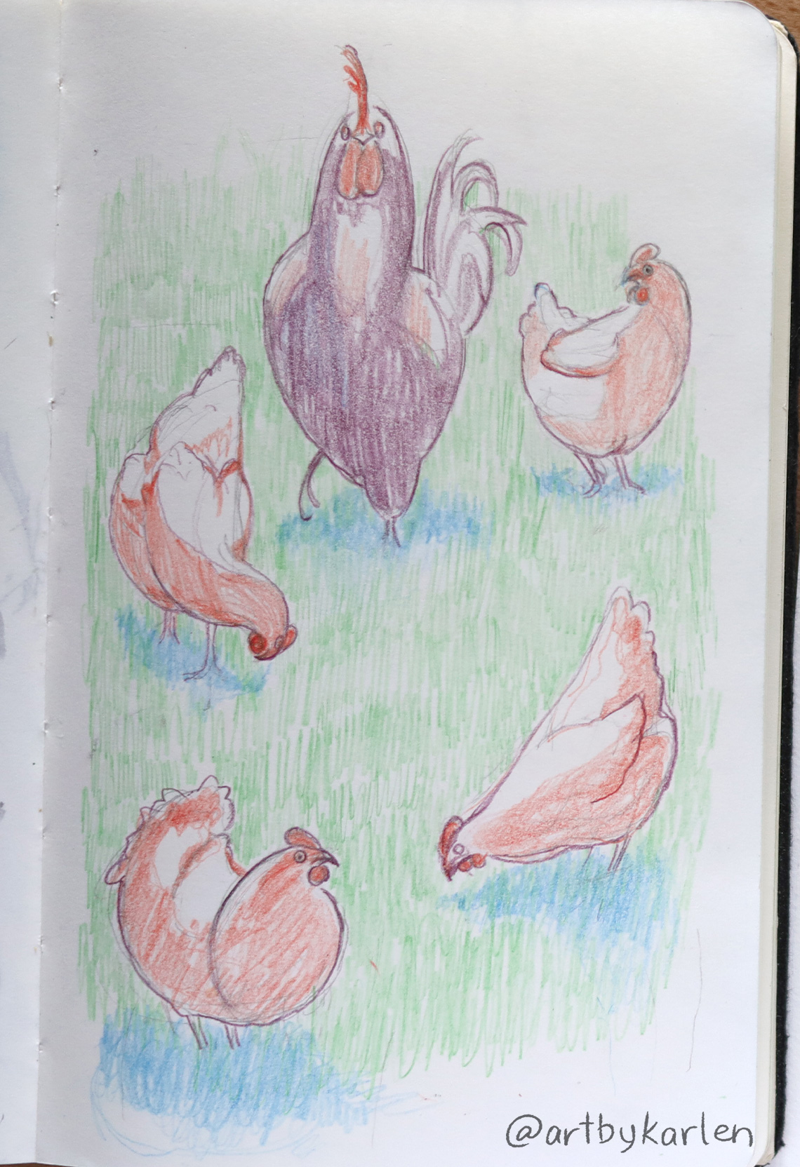
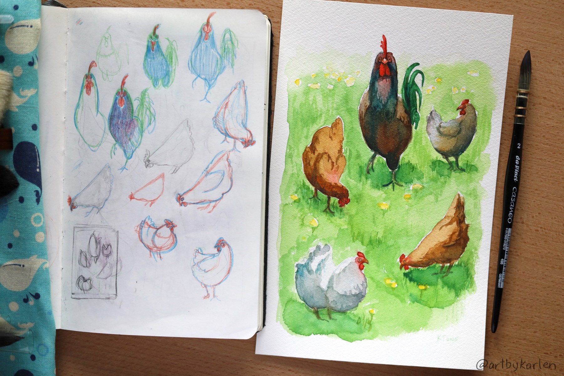
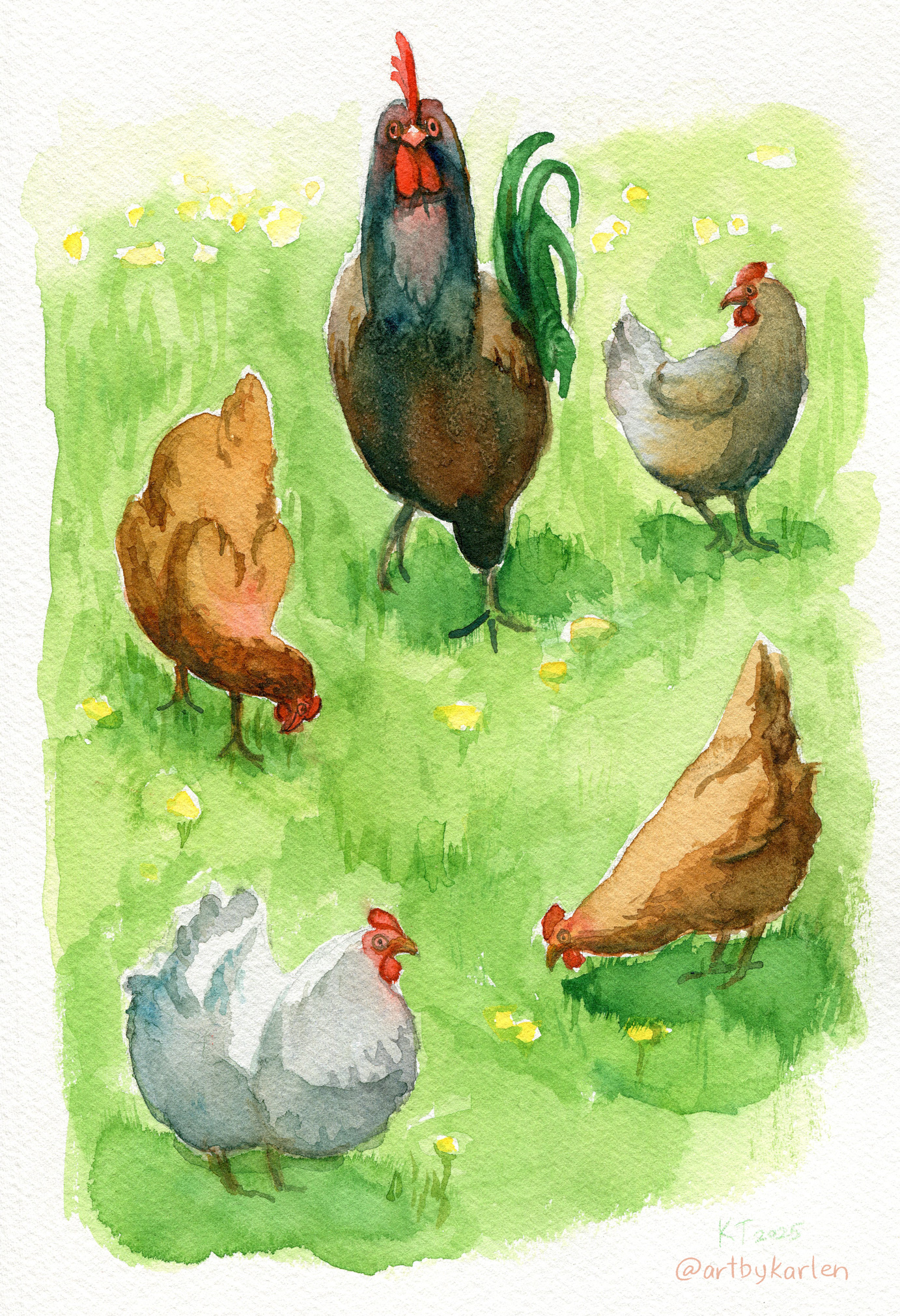
Here’s a simple illustration I made for fun that’s been in the works in my sketchbook. Our neighbors’ chickens roam freely across everyone’s lawns. They follow the rooster and don’t like to get left behind and it’s so funny to see the straggler run across the yard to catch up with the group.

The best thing about chickens is that they don’t give a flying flip about anything except digging for bugs and staying with the brood. They are totally indifferent to oncoming traffic and unfamiliar humans. Have you ever seen them lay down on their sides in the grass? These chickens did that. Chickens have different personalities too. There is a white-grey chicken who is a loner and prefers to wander by herself.

Since I’m doing more art on paper, I needed a better scanner to digitize my artwork. My old scanner always had trouble getting correct colors, and scans were blurry when the paper was wavy and/or slightly raised off the glass. In my research, I learned that there are 2 types of sensors in scanners – CIS and CCD. A Contact Image Sensor (CIS) is in most scanners and require the paper to be in contact with the glass to pick up a clear image. I went with a Epson V300 Perfection, a scanner with a CCD sensor (Charged Couple Device), which is better at capturing accurate colors even over rough and lumpy surfaces like watercolor paper.

This scan has no color corrections and looks true to the painting. You can compare the colors to the photo above. Even though the scanner picked up the texture of the paper, artwork itself was captured accurately.

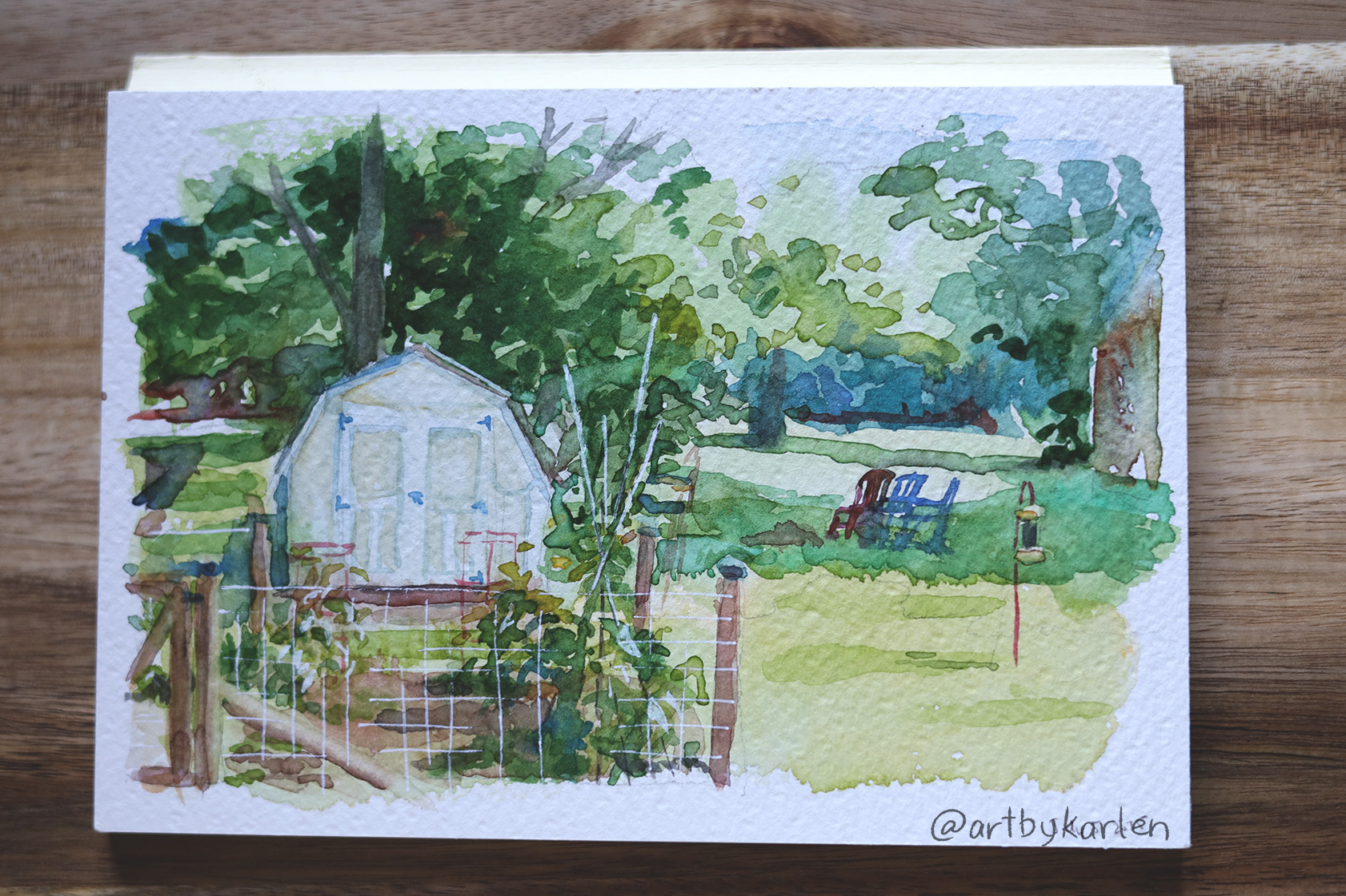
Speaking of colors, I realized how much I like my homemade paint set (show above next to the figure painting) – comprised of mostly Mijello brand paints plus a couple other brands. My plein air set of Schmincke Akademie (student-grade) watercolors seem so much duller by comparison but is appropriate for this subject.

While Schmincke are good watercolors in general, I definitely prefer Mijello. I have a hard time making bright greens whenever I paint on location, but the grass on the chickens painting is effortlessly luminous. It’s probably the difference in paint but I do like the extra mixing wells on the Schmincke travel box. I managed to get a good variety of greens in this sketch though. I guess I should swap the out blue and yellows.

That’s all for today. Thanks for reading!