One of the main reasons I create art is to delight others – even if it’s just one other person. I spend hours composing these posts, and that’s because I know those of you that are here genuinely appreciate my work and that means the world to me. I would love to be able to do that more directly, so I’m starting a snail mail club, where members receive a small piece of my artwork in an envelope every month in hopes that it might brighten their day. I will still keep sharing my artwork here though!
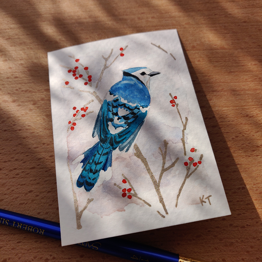
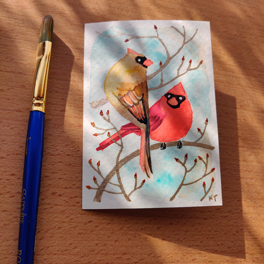
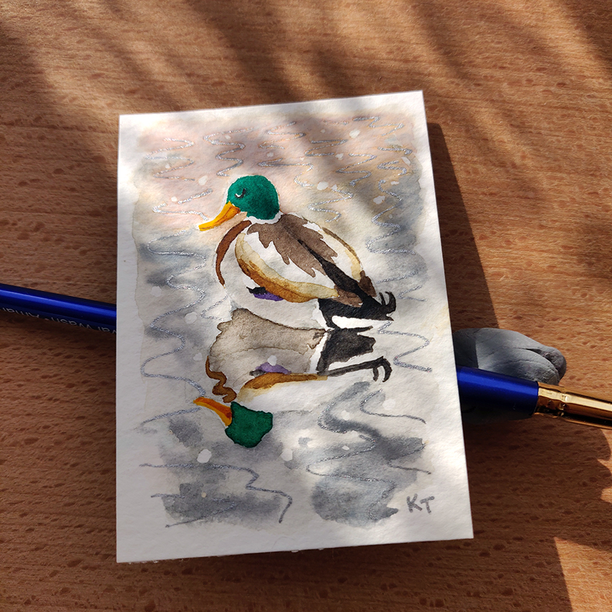
This month’s offerings will be my Winter Bird art cards. Each envelope will include 3 random cards, each one embellished by hand with metallic ink. There’s a lot of symbolism and associations with birds that I found interesting and I think including some light reading gives the illustrations context and meaning. I hope distributing these as physical pieces will make the art more fun to look at and share – these are trading cards after all!
As I am still working on these (printing them, mounting them on sturdy cardstock and making them beautiful and sparkly), and am aiming to have them delivered before Christmas for people in the US. There will be separate subscriptions for domestic and international friends. Please join by the 15th of December in order to receive this month’s artwork!
I got my Christmas artwork done early for the first time ever ~ hurray! In the many years I’ve been making holiday cards, it seems to get harder each time to come up with a new idea without being kitsch or trite. As I write and reflect on my process, I realize new experiences and new memories are made throughout the year, which get added to the well of ideas to draw from; coming up with something didn’t end up being that hard after all. The bottom line for me is always this: tell a story.
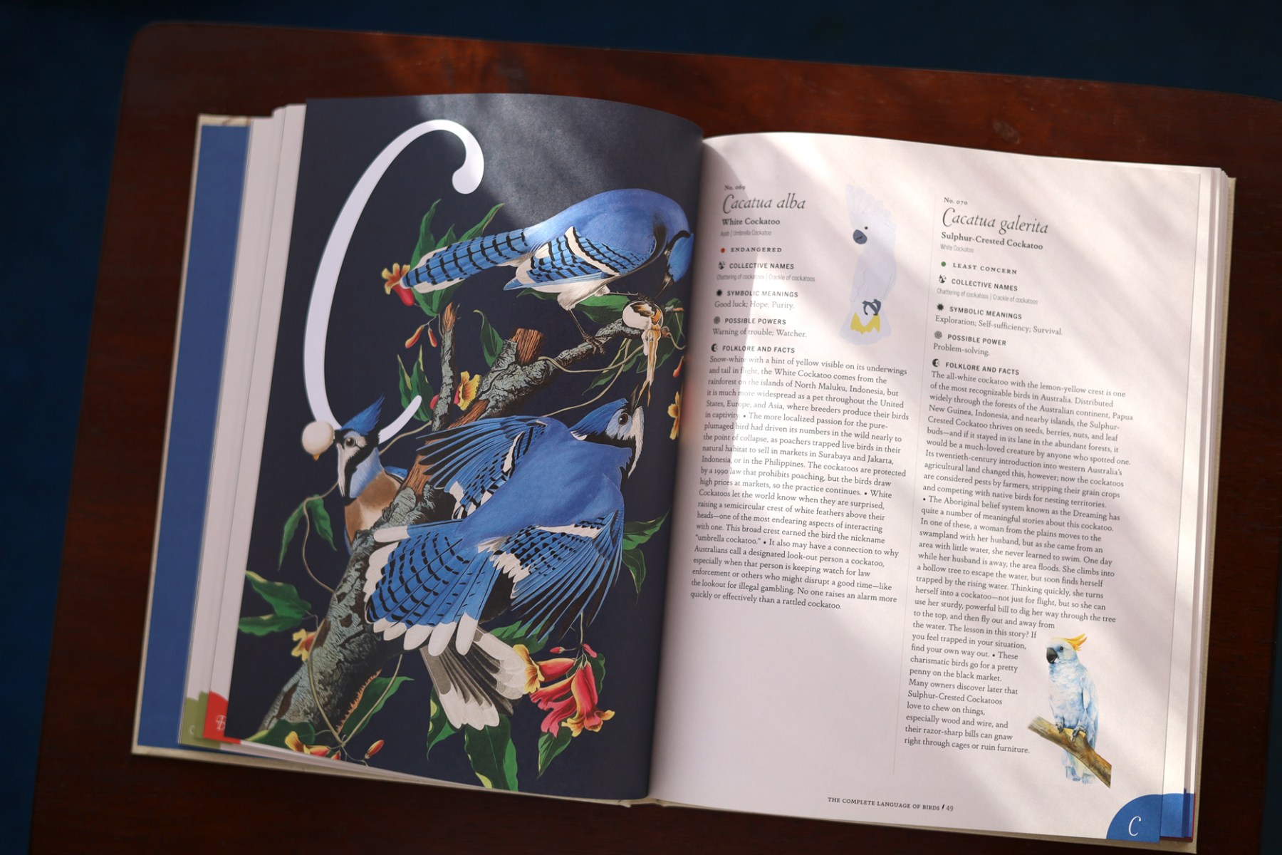
Recently while browsing the book section at a store, this book called out to me: The Complete Language of Birds by Randi Minetor. It’s an illustrated compendium containing hundreds of bird species with facts and folklore associated with each – 100% my jam. It was also the last copy there so of course I brought it home.
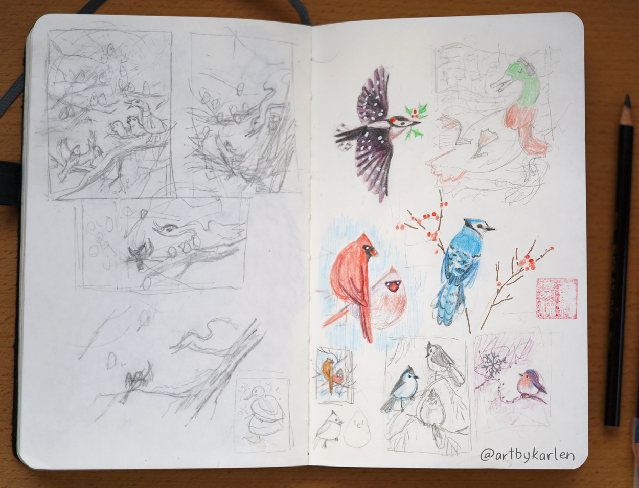
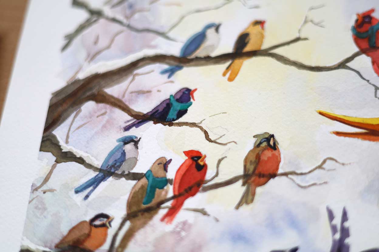
I leave this book around the house and would read about a random bird whenever the fancy strikes. As I was brainstorming ideas for the Christmas card, I thought of recent conversations with friends about our respective individualities, and hatched this idea: a choir made up of birds – and amongst them, a duck. I specifically chose wintering birds as I thought how each of these plucky birds with their unique traits and behaviors are able to thrive in the cold harsh weather. Ducks actually lay in the snow to keep warm! With a downy woodpecker to keep time, wouldn’t all of their different voices make the most wonderful choir?
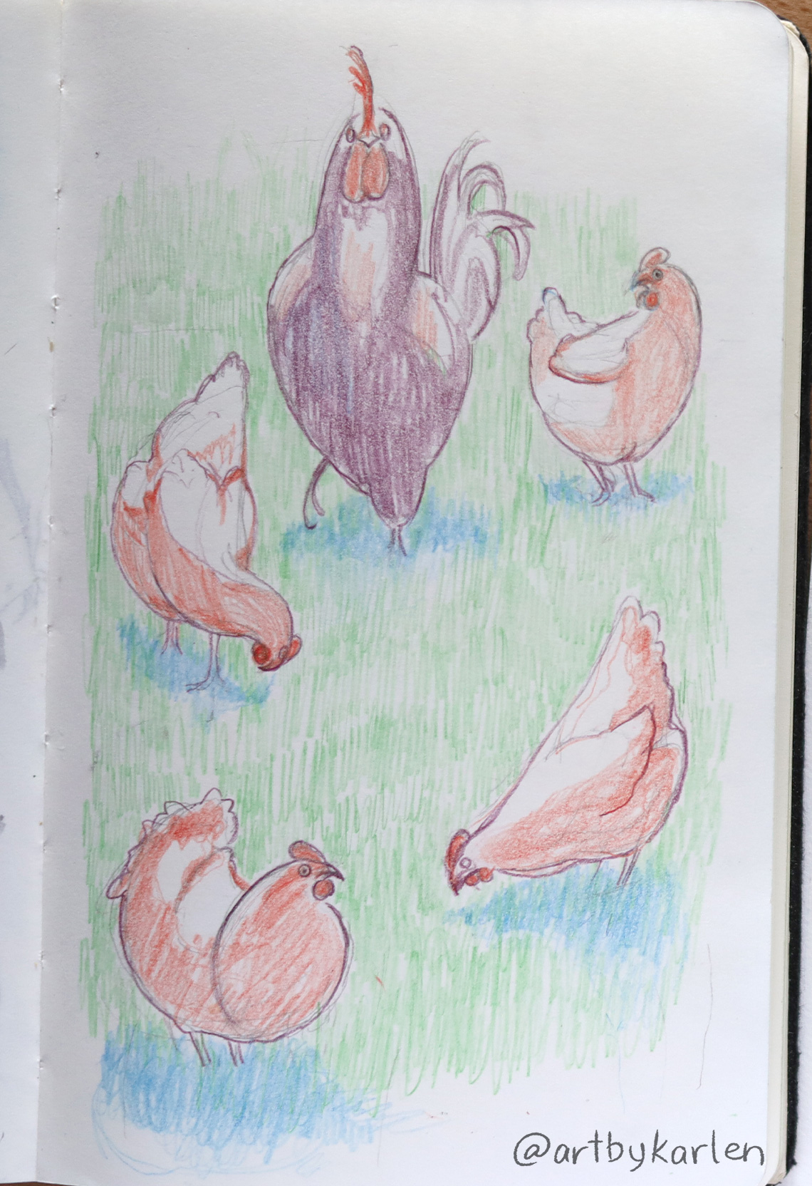
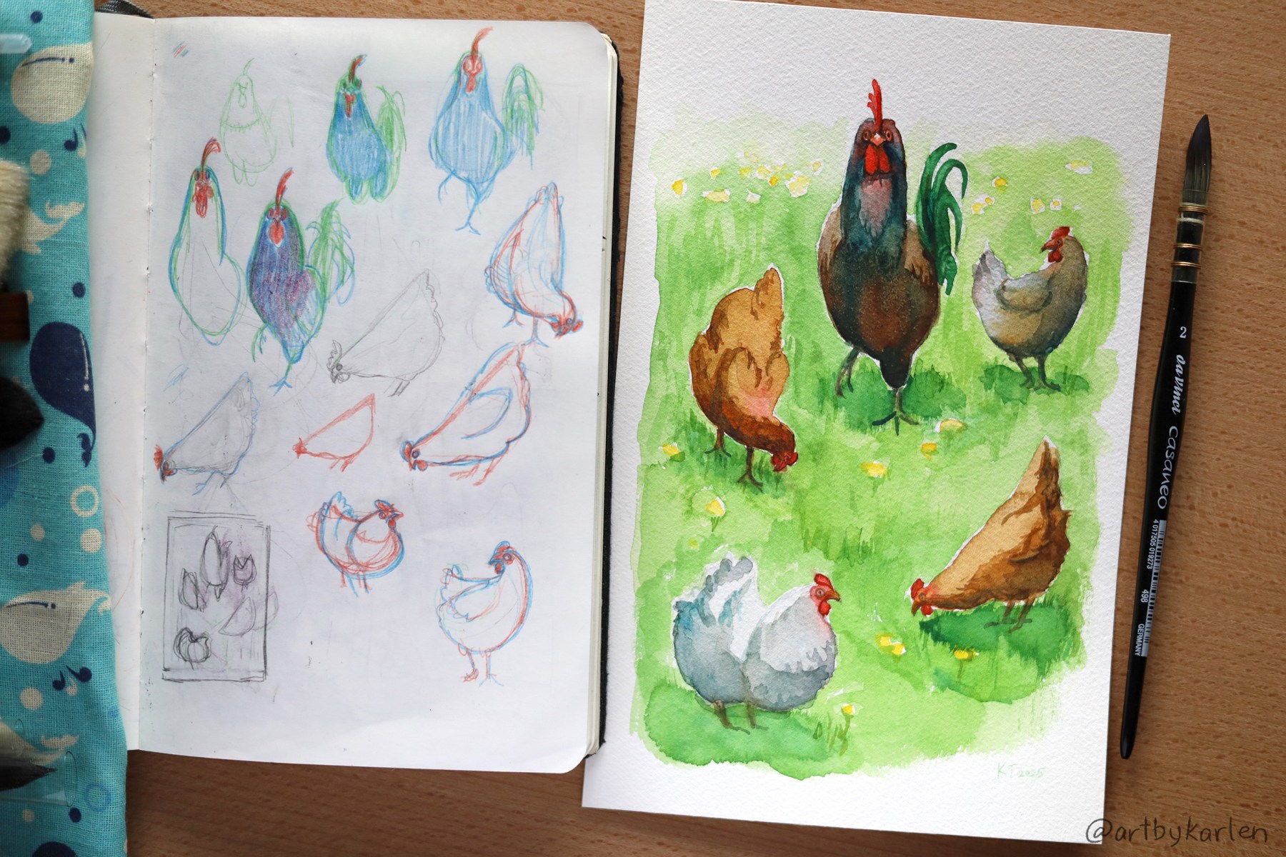
This spread from my sketchbook shows my chicken scratches of the concept as well as a series of smaller illustrations that followed.
Of course with watercolor artwork it’s mandatory to do a test run to determine the colors needed and how to mix them. I also tried painting with a natural sponge for the first time. You can see those textures in the background on the bottom right pinkish blobs.
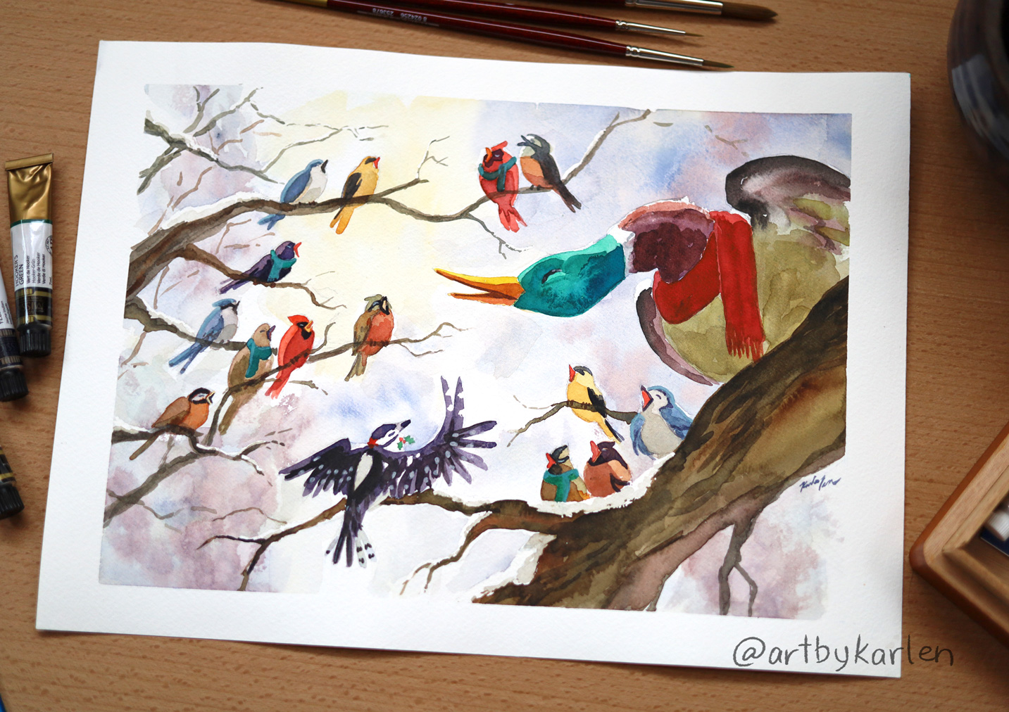
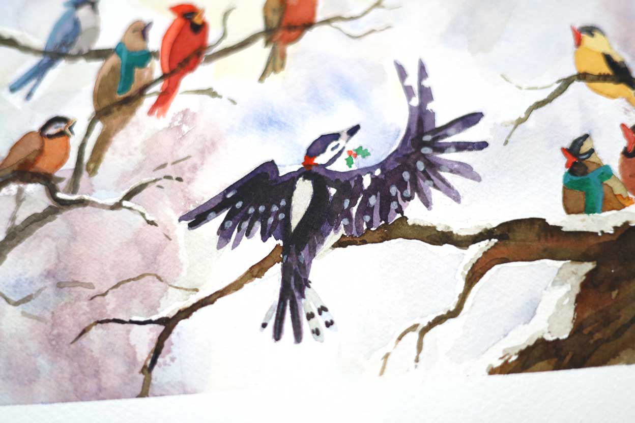
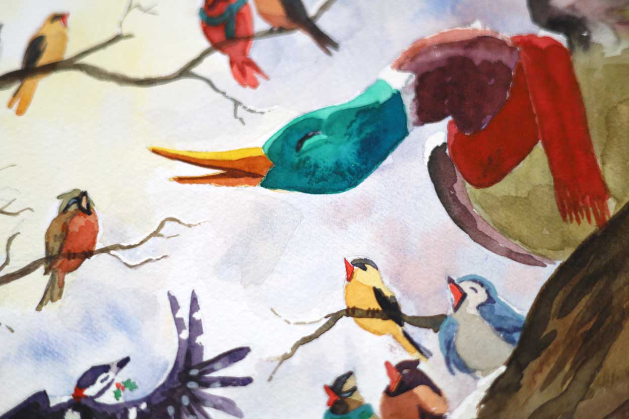
At first I had the idea that the birds next to the mallard would side-eye him in annoyance for being too ducky. But no – I decided he too, is as sonorous as the best of them. Hence that graceful swoop of the neck as he quacks out his lines.
Below is the final 9″ x 12″ illustration done on Fabriano Artistico Cold Press cotton paper. The sponge effects didn’t show up well since I am not as used to this paper, but that may have worked out for the best since too much texture in the background would have been distracting.
Gallery-quality giclée art prints of Choir of Birds are available through Inprnt.
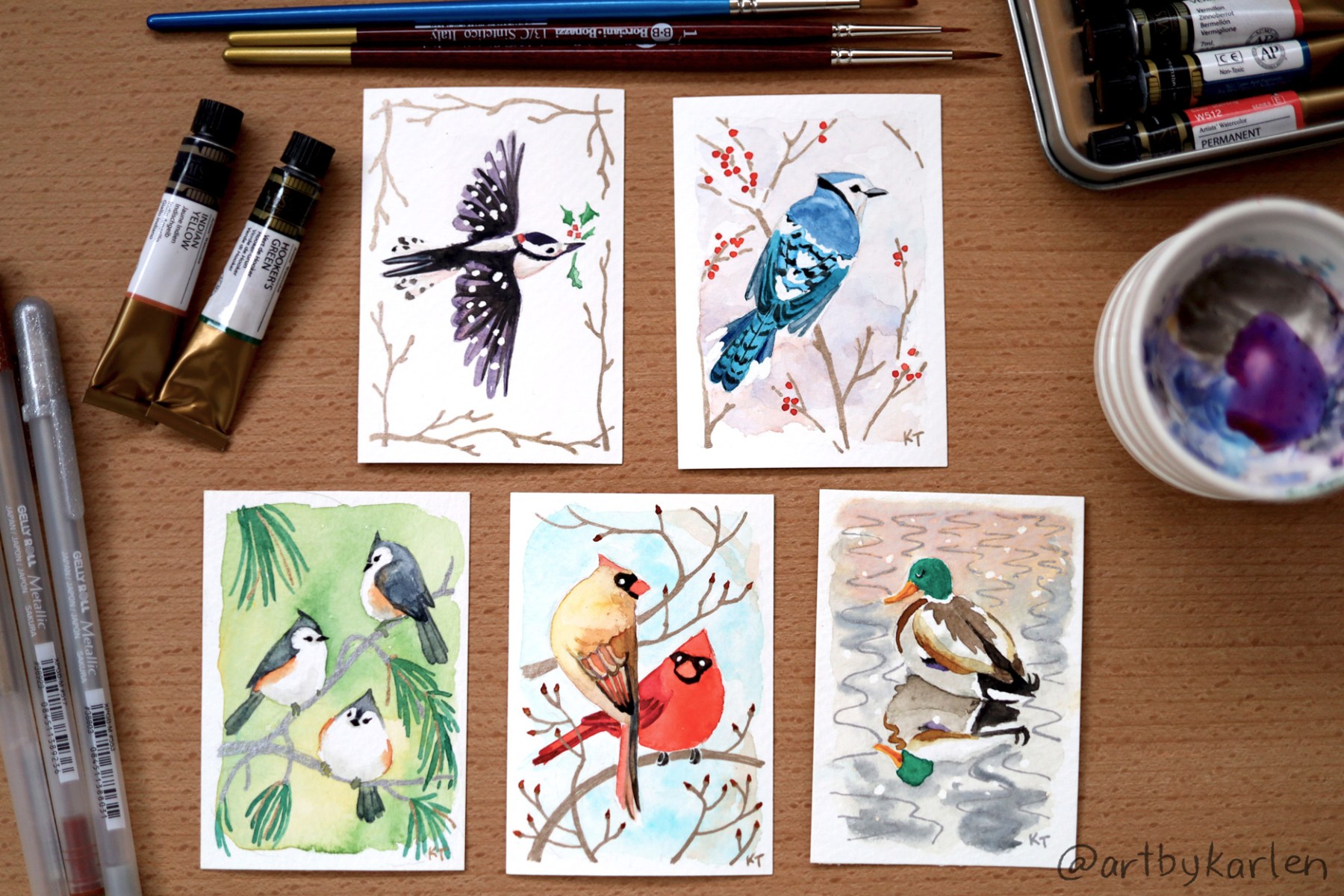
Completing this piece gave me some momentum so I did a series of ACEOs, which stands for Art Cards, Editions and Originals. ACEOs stemmed off of Artist Trading Cards (ATCs), an idea developed by artist M.Vänçi Stirnemann in 1997. ATCs are meant be traded or given away so another artist Lisa Luree started the ACEO group on eBay to make cards available to collectors. The size of ATCs are based on sports trading cards and may be made with any media as long as they measure 2-1/2″ x 3-1/2″.
I made my first art cards as watercolor commissions at trade shows 15 years ago and decided to pick that up again when a co-worker mentioned that ATCs were making a resurgence. Then again, who really needs an excuse to make their own Pokémon cards? One of my commissions back then was actually a Snorlax!
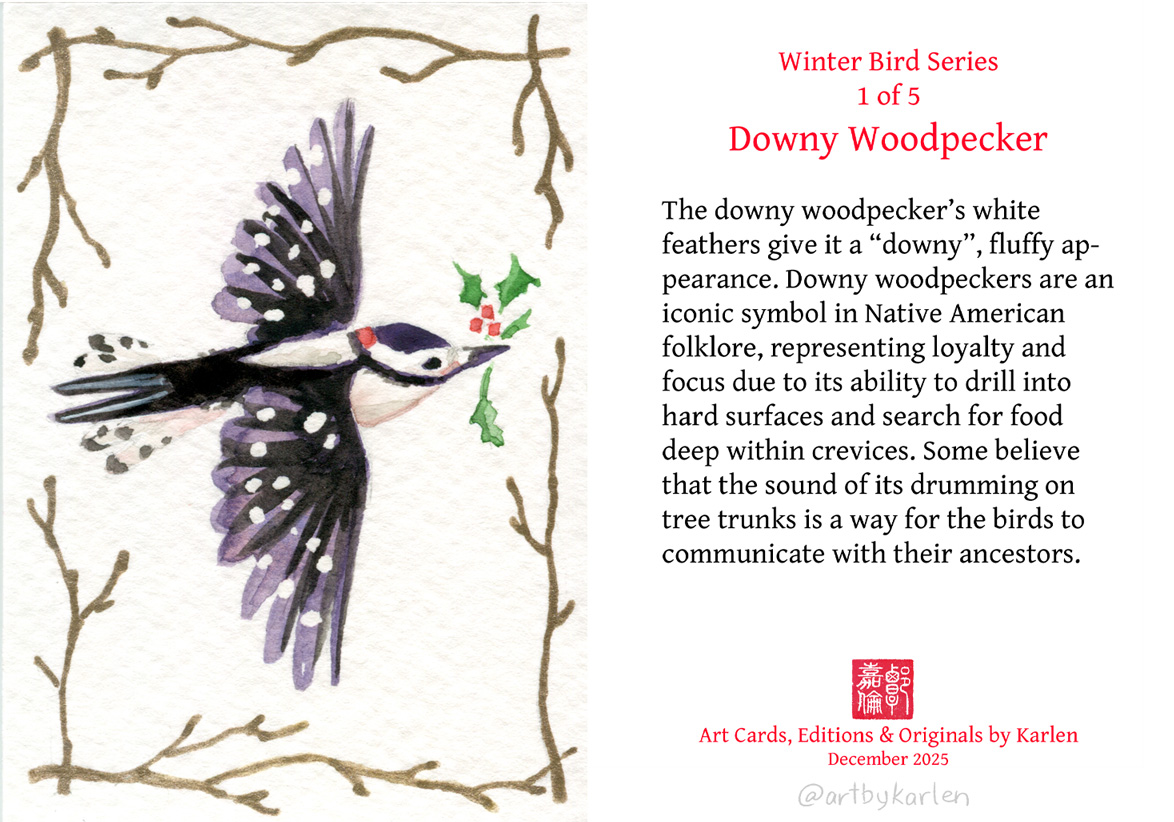
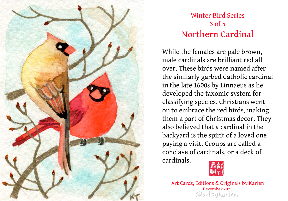
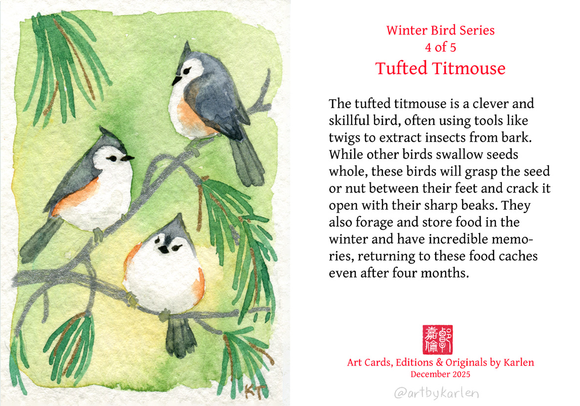
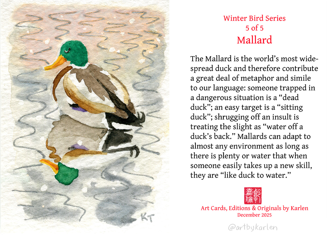
In the upcoming weeks I will be making a limited run of prints of my winter bird ACEOs, hand-embellished with the sparkly metallic ink as on the originals. As I think about the design on back side of the cards, it might be fun to share the folklore associated with these five birds that I learned from my book.
The finished pieces of artwork here are all available for purchase and I have set up a shop page for them. This is the first time I’m making my original physical pieces for sale online, so my website lacks full functionality as a store; I do not have an “Add to Cart” button, so to purchase multiple pieces, please send me a message so I can make an invoice for you with combined shipping.
I’ve been going back to basics and learning to draw human anatomy (painting portraits is also part of the practice). That means learning which bones go where, which muscles go between and over them and how they squash and stretch depending on the pose. The drawings aren’t nice to look at but the process of doing them helps me understand and remember. Maybe I’ll show them if and when they actually look good.
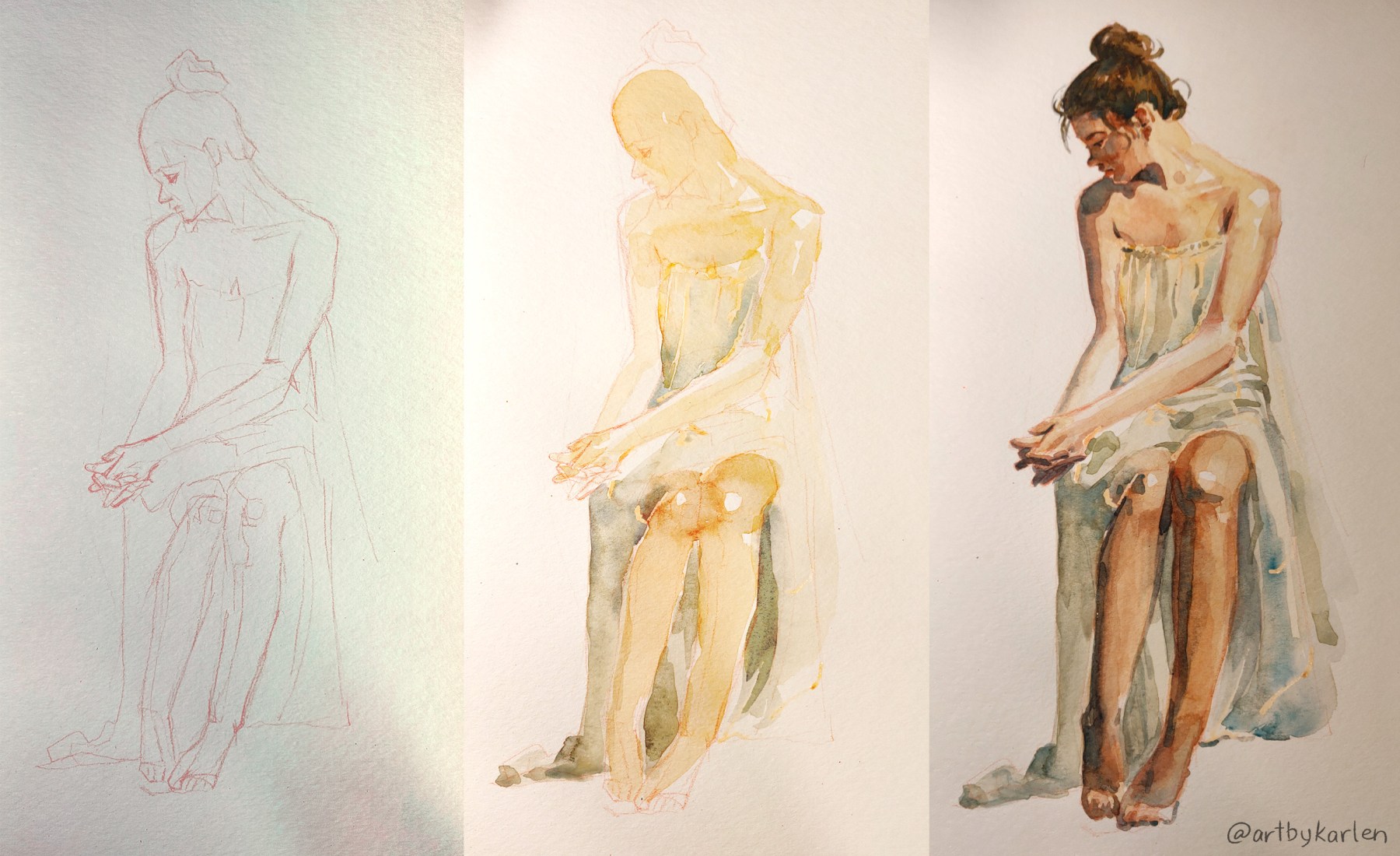
But I’ve been neglecting my watercolors so I remedied that with a figure drawing and painting over it. I got some new masking fluid (a.k.a frisket) on a whim at the art supply store but had awful experiences with it so I did some research before trying again. The internet suggested using an embossing tool (basically a metal stick with a tiny ball on the end) for application, so I found a new gel pen that still had the rubber covering over the tip in my drawer and it worked perfectly. It’s the light orange stuff on the drapery. It should be brighter and be more visible on the paper but the bottle I got was sitting on the store shelf for a while so the tint was stuck at the bottom and didn’t disperse even after much vigorous shaking.
Pardon the lighting – I was drawing/painting at night and lamps don’t play nice with the phone camera. I did the sketch in red pencil and edited for visibility but the drawing is very faint in real life. But here’s the finished painting under daylight to see the actual colors. I usually prefer not to use frisket because the edges created by masking are too harsh but it worked well with light values here. I also softened them a tad with the lightest dab of a wet brush.
I’m pretty happy with how this came out and also surprised how soft the painting looks compared to the very angular drawing. Even though this study was done with a photo reference, it helped so much to know what bones are underneath.
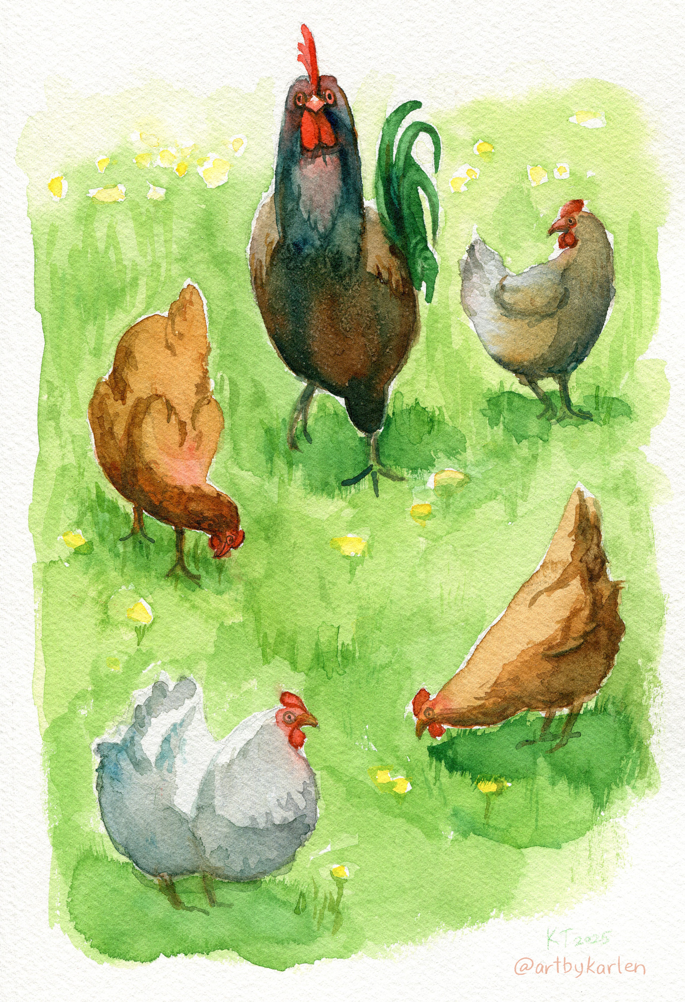
Here’s a simple illustration I made for fun that’s been in the works in my sketchbook. Our neighbors’ chickens roam freely across everyone’s lawns. They follow the rooster and don’t like to get left behind and it’s so funny to see the straggler run across the yard to catch up with the group.
The best thing about chickens is that they don’t give a flying flip about anything except digging for bugs and staying with the brood. They are totally indifferent to oncoming traffic and unfamiliar humans. Have you ever seen them lay down on their sides in the grass? These chickens did that. Chickens have different personalities too. There is a white-grey chicken who is a loner and prefers to wander by herself.
Since I’m doing more art on paper, I needed a better scanner to digitize my artwork. My old scanner always had trouble getting correct colors, and scans were blurry when the paper was wavy and/or slightly raised off the glass. In my research, I learned that there are 2 types of sensors in scanners – CIS and CCD. A Contact Image Sensor (CIS) is in most scanners and require the paper to be in contact with the glass to pick up a clear image. I went with a Epson V300 Perfection, a scanner with a CCD sensor (Charged Couple Device), which is better at capturing accurate colors even over rough and lumpy surfaces like watercolor paper.
This scan has no color corrections and looks true to the painting. You can compare the colors to the photo above. Even though the scanner picked up the texture of the paper, artwork itself was captured accurately.
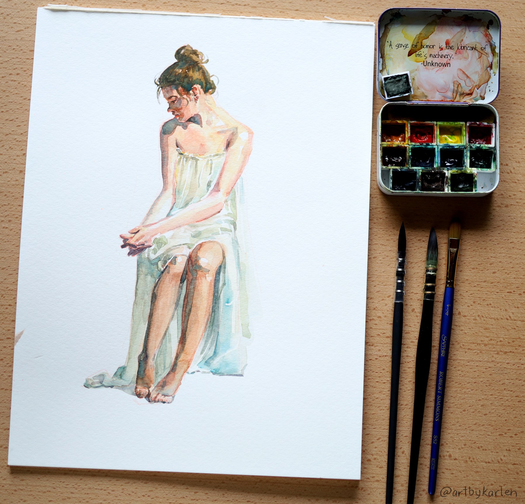
Speaking of colors, I realized how much I like my homemade paint set (show above next to the figure painting) – comprised of mostly Mijello brand paints plus a couple other brands. My plein air set of Schmincke Akademie (student-grade) watercolors seem so much duller by comparison but is appropriate for this subject.
While Schmincke are good watercolors in general, I definitely prefer Mijello. I have a hard time making bright greens whenever I paint on location, but the grass on the chickens painting is effortlessly luminous. It’s probably the difference in paint but I do like the extra mixing wells on the Schmincke travel box. I managed to get a good variety of greens in this sketch though. I guess I should swap the out blue and yellows.
I started this newsletter as an alternative to social media for sharing my art, which I felt never presented my work in an ideal format. Sending out this newsletter has been a long time coming, and to be honest, is more intimidating than making an IG post, where I know my contribution is just feed fodder. So let your continuation with the rest of this post be a conscious choice to engage a little deeper. In any case, thank you for being here and being interested in what I have to share, even if they’re not masterpieces.
For the past year I’ve been working three jobs – not simultaneously, but sporadically – strategically slotting in whatever fits into the week depending on the tasks and their due dates. I want to blame my current existential crisis of not being a real artist on not having time to work on personal art, but in the spare moments I had to reflect, I’ve pieced together an unsettling truth. I realized it’s actually easier to work for others – to hide behind the nobility of serving a bigger cause (and to pay the bills); it takes more courage and grit to face my own blank canvas.
“Since I have so little time to do anything, the next artwork I make must be a masterpiece to make it all worthwhile!” The pressure to create anything under this mentality causes so much friction that I produce nothing – not even a little sketch, which is all I have energy for by the end of the day. Not to mention that the connection to my imagination has already atrophied from disuse. To counter this, I’ve returned to real paints and paper – specifically, watercolor because proficiency in this medium requires speed and repetition. Here are some of my practice paintings that are palatable.
My comfort zone has always been landscapes – I can get away with a lot by just painting impressions of things. The shapes can be vague and the painting will still make sense if the composition and perspective work.
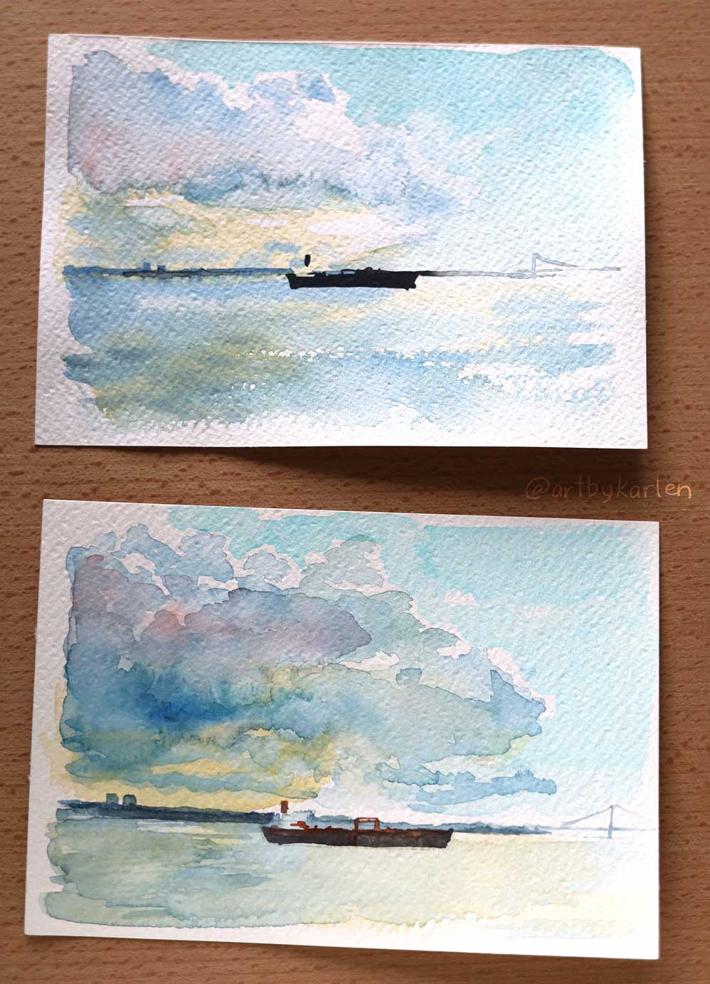
Here are two 4″ x 6″ sketches that I did twice because while the clouds and water came out well on the first, I didn’t like boat and the placement of the horizon. But on the second attempt, the sky got too dark, while the boat is more refined. I have always struggled to control water flow and intensity of the colors. Maybe painting the third one would have been perfect? We will never know.
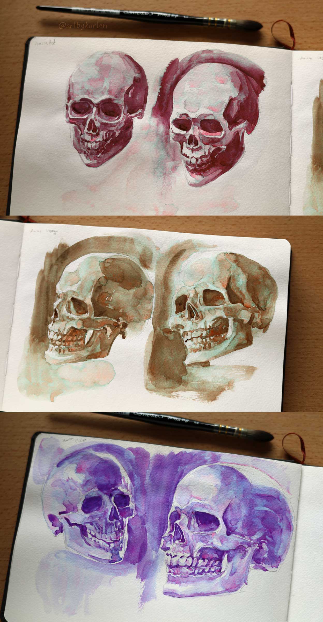
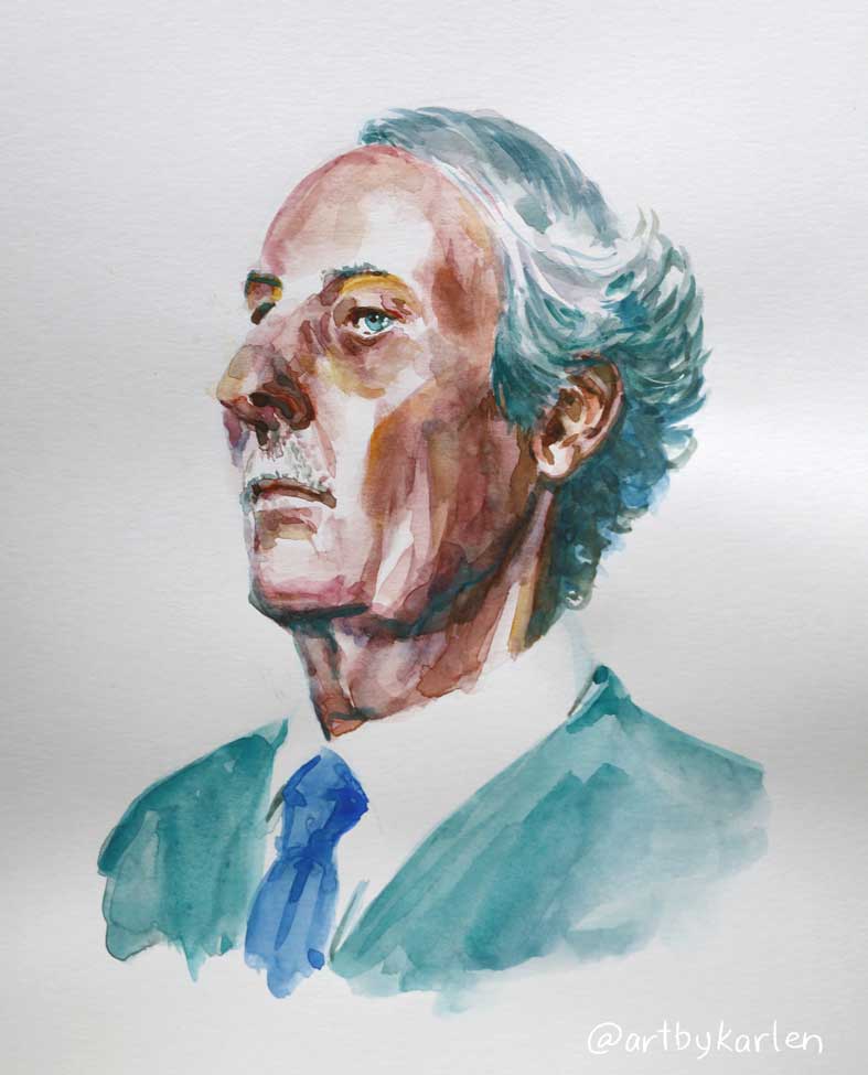
I then decided to really learn to watercolor, I’d have paint subjects that require precision. I will try painting human faces – I can’t fudge that because we are so used to seeing other humans that it’s painfully obvious if something is off. So I started off by studying a model of a skull, which I set under a lamp.
These studies were done in a Hahnemühle 5″ x 8″ watercolor sketchbook with the Kuretake Gansai Tambi Granulating paint set (“granulating” means the colors separate when water is added). I got these paints intending to use them for value studies because I can’t control what the colors will do – only how dark or light they’ll get. The striking color effects are a bonus bit of flair. I included the ugly sketch to show the jump in understanding of paint application between the first set of skulls, which were done in one sitting. The skulls behind these pages are grimacingly awful so I will spare you the sight of those.
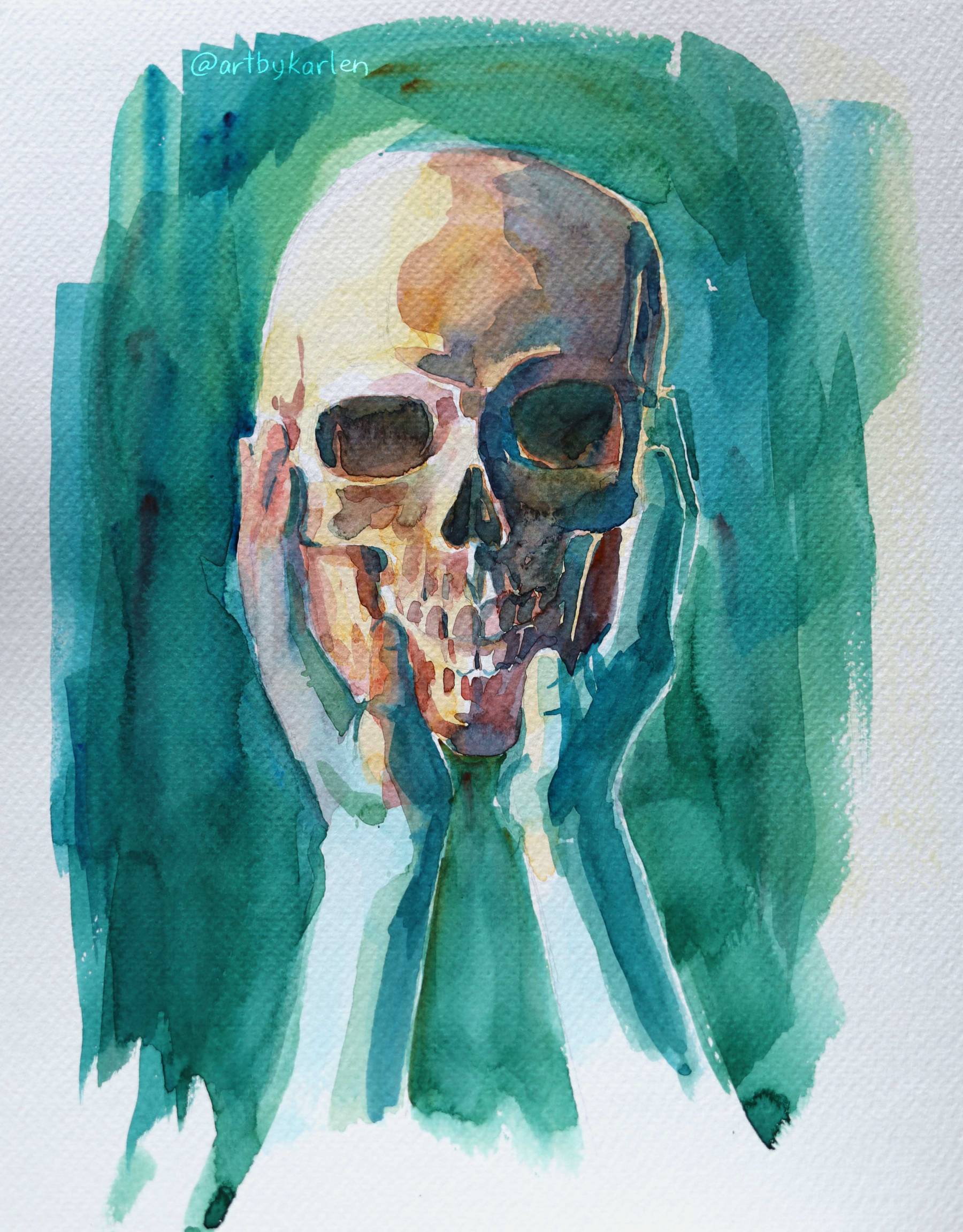
Several skulls later I tried making a concept out of the studies. I used regular watercolors on a larger sheet of 9″ x 12″ paper. One would think it’d be easier to paint bigger but I struggled to keep the paint wet across sections to achieve smooth color transitions. If I were to paint this again (for the third time), I’d use a more limited pallet and spend more time refining the drawing.
Recently I did a full illustration in watercolor, thinking I might be able to pull off something decent only to be humbled by the end of working on it for weeks. It was clear I needed much more practice, so I filled pages with more face studies, occasionally daring to try on a larger sheet.
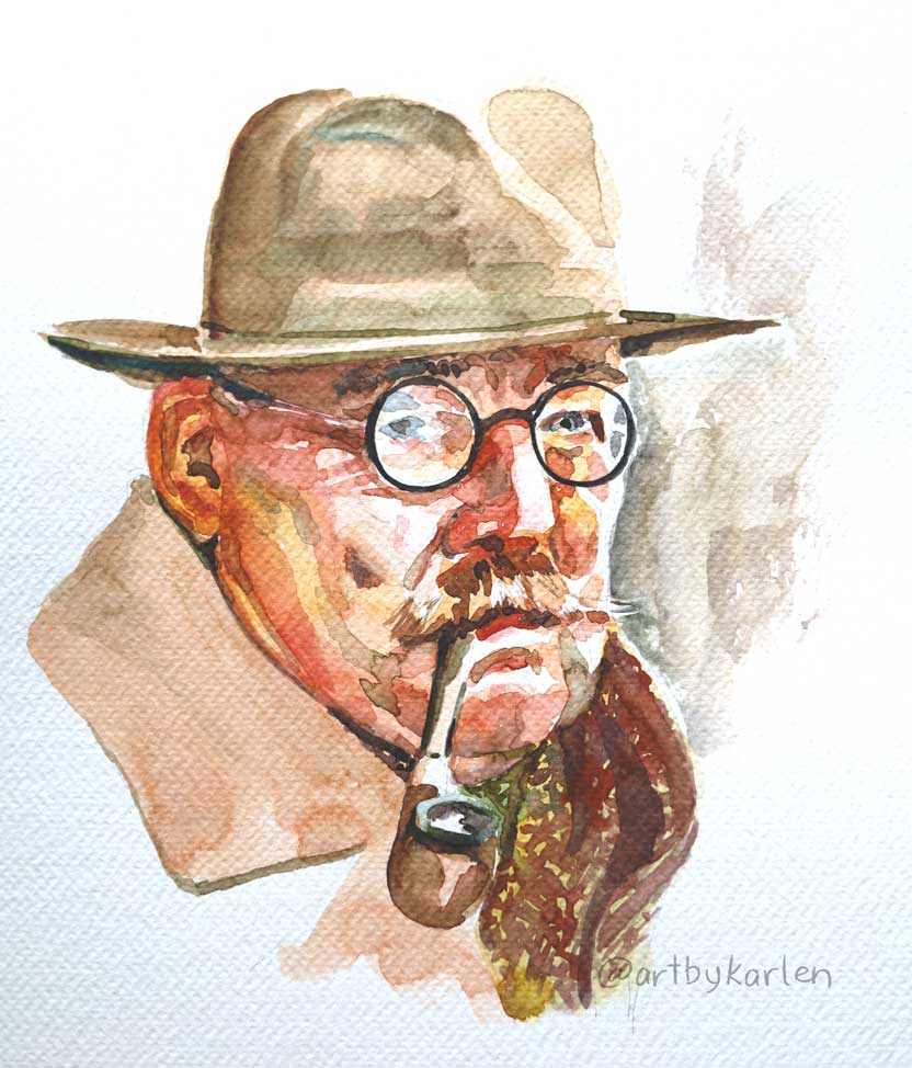
Everyone says using the best watercolor paper is half the battle, and that practicing on crappier paper will hinder progress, but I still can’t justify using the premium stuff yet. In my pursuits, I stumbled upon this book in the library – Breaking the Rules of Watercolor by Burt Silverman, who as implied by the title developed his own unconventional way of painting, similar to how he worked with oils.
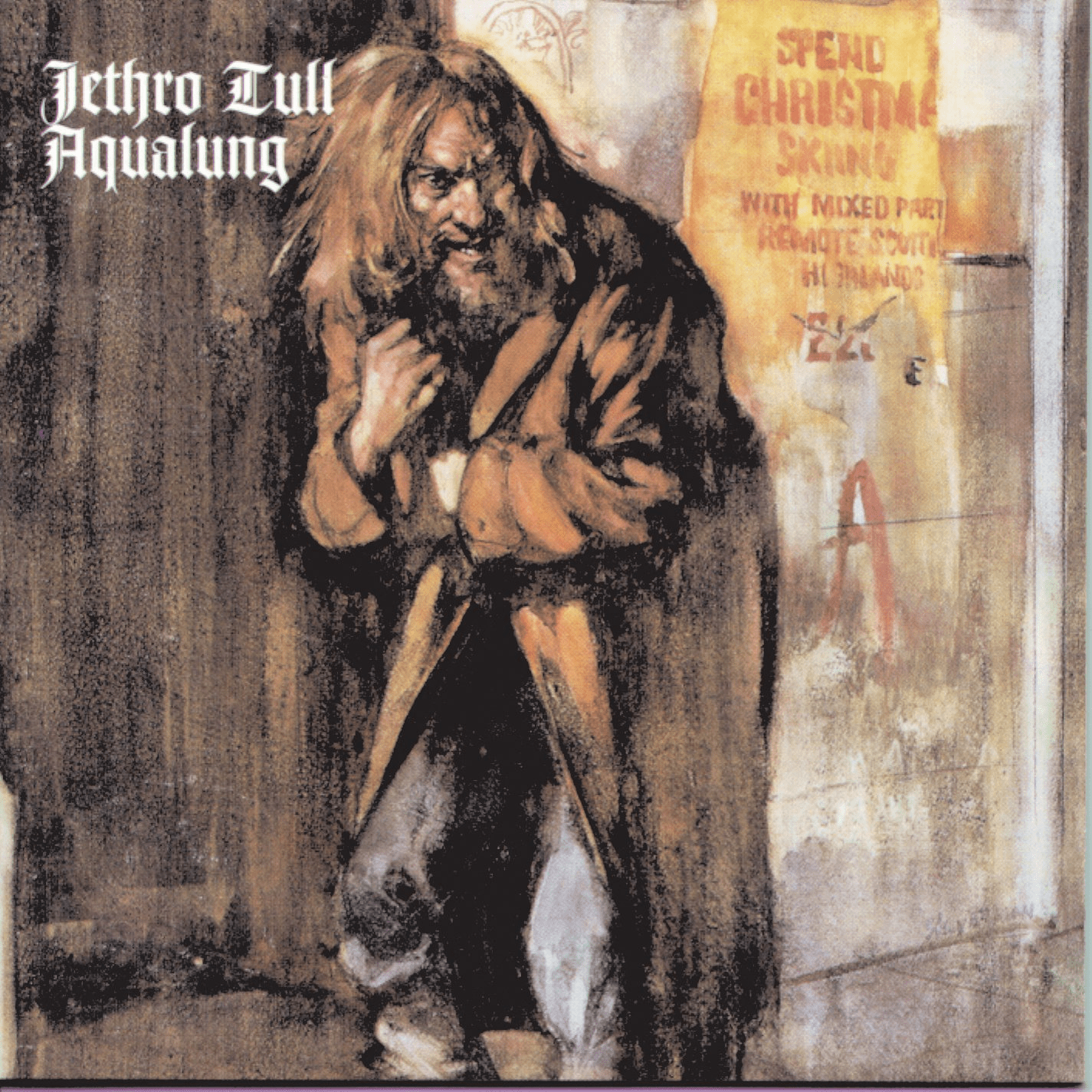
Some music-art trivia: Silverman painted the album cover for Aqualung
Most notably, he used plate bristol so that the colors slide around more and take longer to sink into the paper, so he was able to mash the paint around and even nearly erase parts of the painting. He didn’t worry all that much about having smooth color transitions.
I’d never heard of anyone using that paper for watercolor so I was curious to try Silverman’s techniques. I didn’t have any plate bristol handy but I had some bristol smooth paper, which is probably comparable in a pinch, but much more prone to warping. The elderly man below is the result of the experiment – it’s definitely a different approach to applying paint.
Besides the painting demos, I enjoyed Silverman’s philosophy and insights about the creative process – that there’s no correct way to do it. Since I have a ways to go with watercolor though, I should learn the rules before breaking them, so I went back to painting the “regular” way. I’d be mostly satisfied with this gentleman’s portrait if only his ear and jowls were less yellow. Maybe painting old people is more forgiving because they are allowed to have blotchy skin. But the bigger lesson is to be forgiving about making crappy paintings don’t go anywhere.
After a ton more practice, my goal is to be able to sketch, ideate, and finally produce polished illustrations in watercolor or even mixed media, as complex as some of my digital paintings. I also realize that trying to recreate my digital artwork with human hands and pigmented water may be counterproductive. I may end up redefining my “style” though I don’t think I have one so I might be spared from that impending existential crisis. I will still make digital art though, as it’s the fastest way to get a finished piece. I’m just less inclined to do so these days after endless hours working on a screen. For better or worse, I am grateful to be able to work at home, drawing for a living while I can. I don’t need to touch grass I need to touch paint.
At the risk of making this post too long, I leave you with this quote to ponder.
A work of art is the unique result of a unique temperament. Its beauty comes from the fact that the author is what he is. It has nothing to do with the fact that other people want what they want. Indeed, the moment that an artist takes notice of what other people want, and tries to supply the demand he ceases to be an artist, and becomes a dull or amusing craftsman, an honest or a dishonest tradesman. He has no further claim to be considered as an artist. -Oscar Wilde
Thank you for reading.
You may reply to this email directly if you don’t want to leave a public comment :)
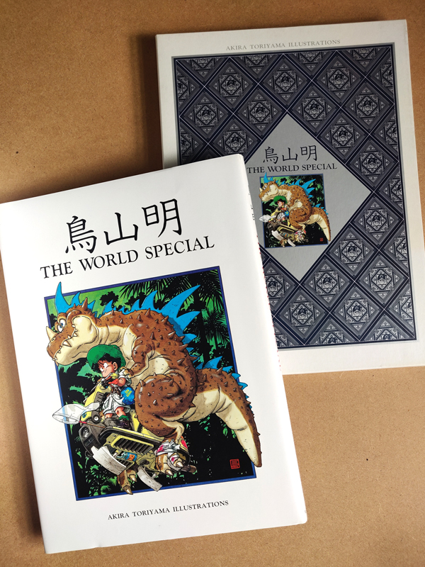
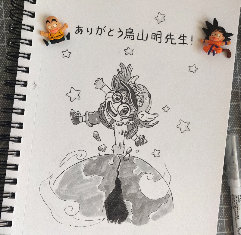
I have been procrastinating about writing this first newsletter because my default idea was to outline my process of a recent artwork, but didn’t seem like it would be that interesting. Since Mr. Akira Toriyama’s passing (may he finally get some rest), I thought about how much he influenced me from the very beginning. Like every other artist, I collect artbooks, and today I want to share one of my treasures that I found nearly 20 years ago.
It was my first time at New York Comic Con – a friend from high school Go Club had invited me but when I arrived he quickly ran off with some people I didn’t know. But I really couldn’t care less! I was surrounded by amazing artists, most of whom were too scary to talk to at the time, but there were so manybooks.
At the very back of the exhibitors hall was a booth selling used books out of cardboard boxes stacked on fold-up tables. After flipping through the entirety of several boxes, I found this treasure wrapped in plastic, with a neon orange sticker price of $59.99: The World Special: Akira Toriyama Illustrations.
The book is housed in a beautifully designed slipcase with the cover illustration framed by a blue and silver diamond motif of Son Goku’s face from Dragon Ball. The Dragon Ball series preceded Dragon Ball Z and was loosely inspired by the Chinese novel, Journey to the West. He dons the infamous circlet that Monkey King wears on his head and the kanji on his bandana is “Son” of Sun Wu Kong (a.k.a the Monkey King).
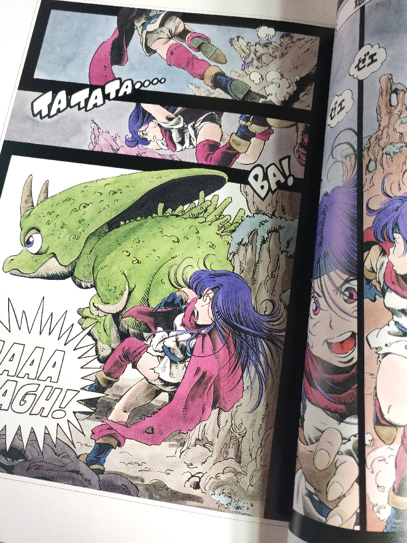
I loved Dragon Ball and watched for as long as it would rerun on Cartoon Network. What attracted me most was the universe Akira Toriyama presented through Goku’s adventures. There was always feeling of childlike wonder in Toriyama’s depictions of human and animal characters, sci-fi mechs, and dinosaurs that roamed the frontier.
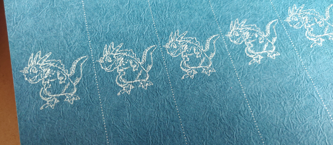
The endpapers have cute dinosaur pattern printed in silver on textured navy blue paper. He reminds me of Icarus from DBZ.
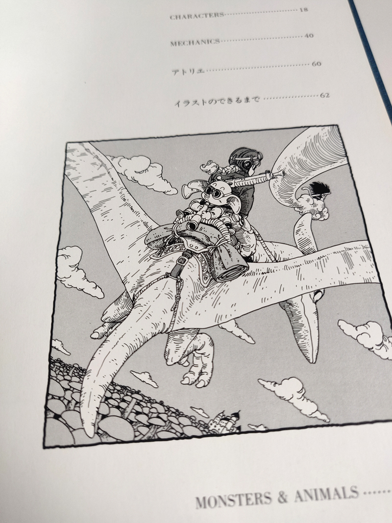
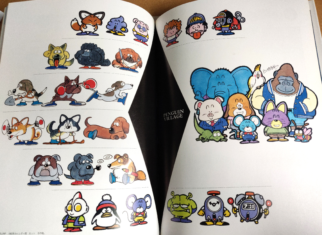
The illustrations are organized into chapters featuring characters, mechanical designs, animals and monsters, and worlds.
There’s a beautiful black and white drawing on the table of contents. It depicts a moment when the Dragon Ball crew traverse the giant mushroom forest in the desert. I really love the tilted angle, simplified tones (only two!) and the linework. The lines are mostly uniform in width but the curved hatching lines show the form of the dinosaur, its rough skin texture as well as the lighting direction in the environment.
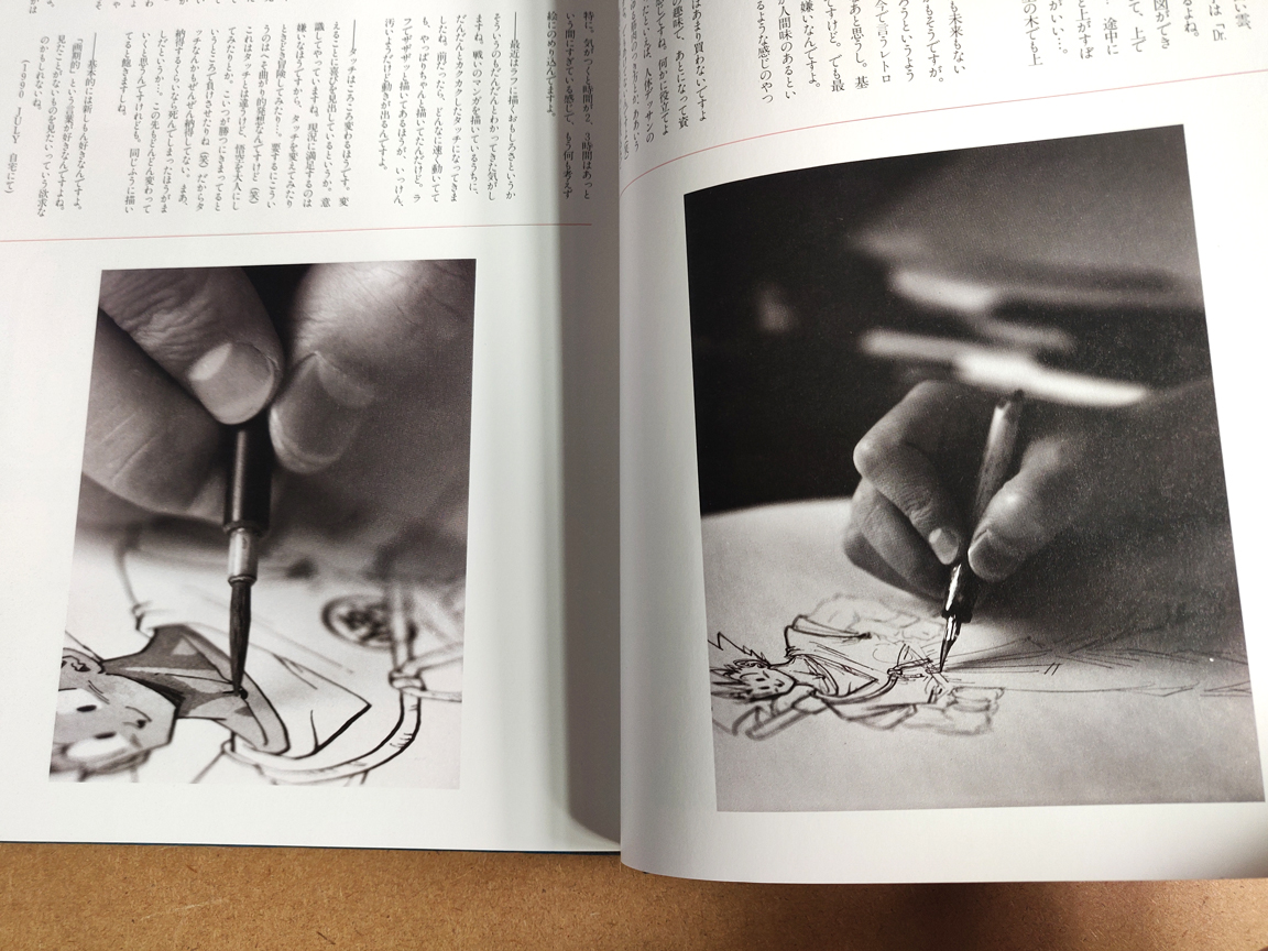
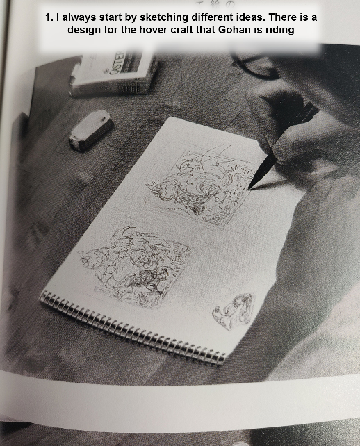
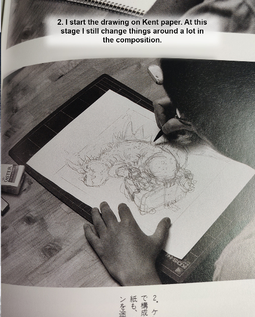
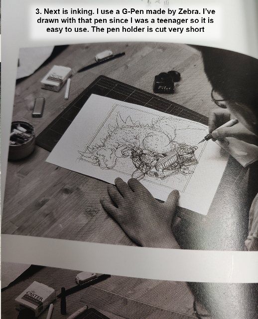
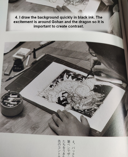
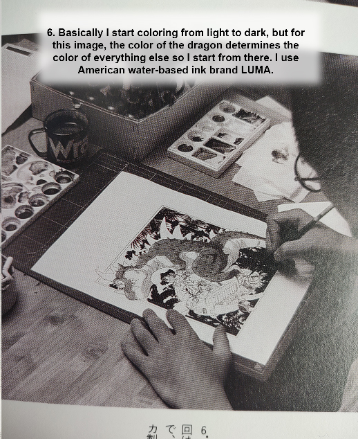
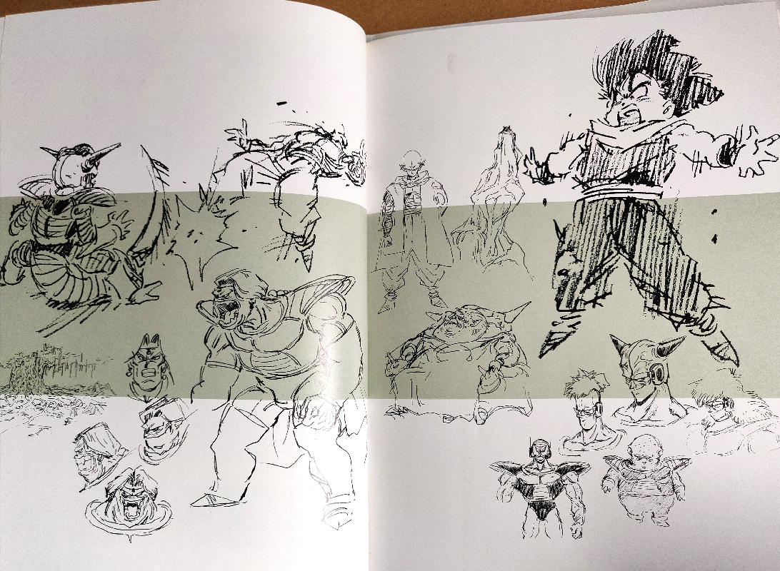
The real treat of this book is seeing his works in progress. In one chapter, Toriyama shows his process for the cover artwork. I tried my best to summarize his words using Google Translate. He says the entire piece took him two days to finish.
(Click on images to expand)
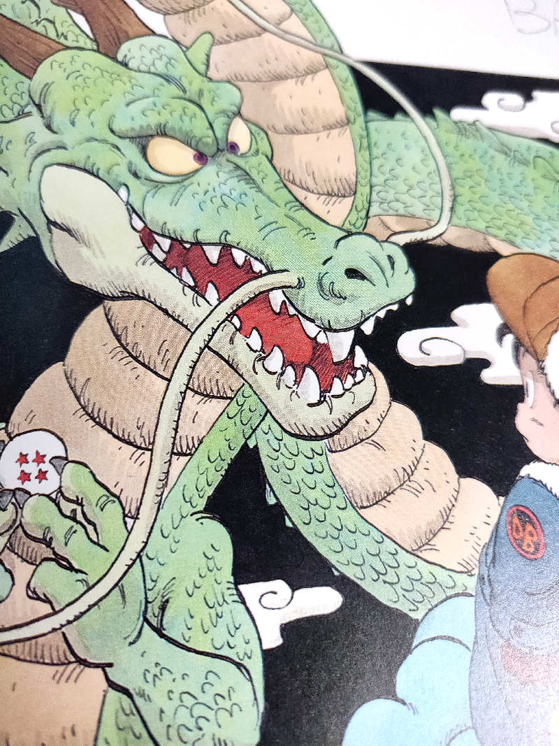
In step 3, he mentions his pen that he’s used since he was a teenager. There is a close up of it on the header image of this post. I had to do a little more research because the photo isn’t clear; “It’s cut short” seemed like a bad translation. But yes, the pen was literally cut short. It’s a wooden pen holder that he shaped to suit his preferences using a knife and sandpaper. He says he bought many other pens over his career but always came back to this original pen because he felt that his drawings came out badly if he used any others. He even stopped drawing after finishing the Sand Land manga because he had lost his favorite pen!
Here are some more closeup photos of a few pages. The page of DBZ rough sketches is one of my favorites – that one of Gohan with his arms spread out feels so visceral – the direction of the hatching adds to the emotion so well.
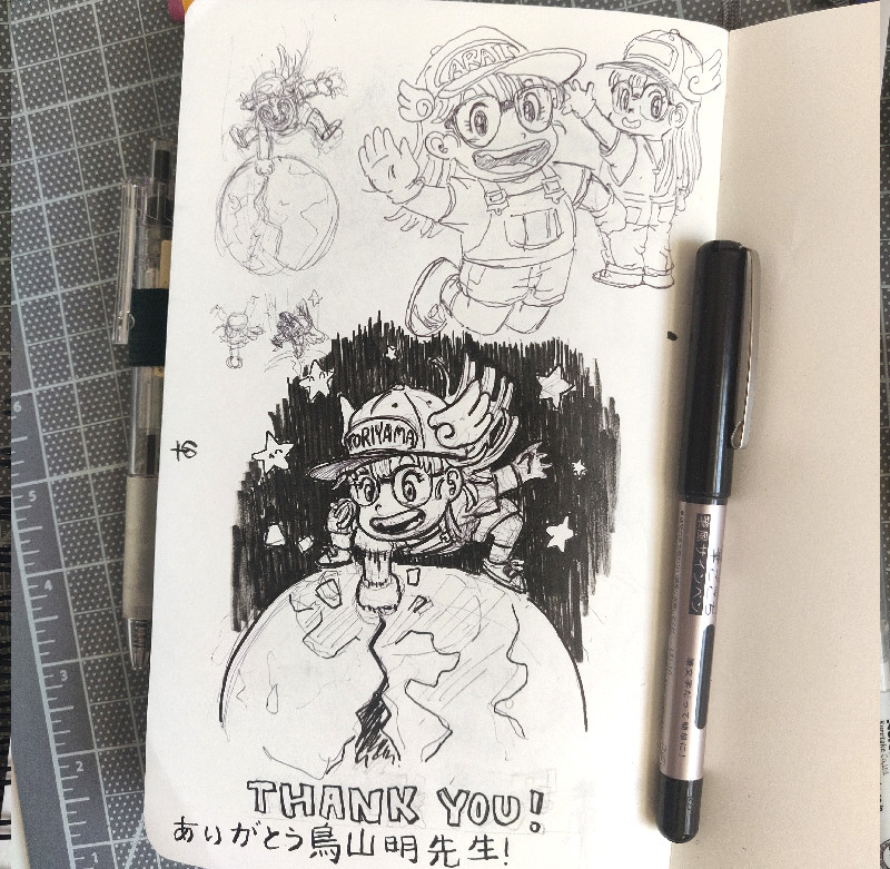
This book has hundreds of beautiful drawings that I can’t possibly share them all, but many of them have been digitized and can be found fairly easily on the internet. It was nostalgic to flip through this book again to remind myself of my earliest drawings. But now I also am able to appreciate the artistry in Mr. Toriyama’s works that weren’t apparent to me back then. The biggest takeaway looking through this book is that he had so much fun making these drawings – something I struggle with nowadays. This is a great reminder to try to find that again. As a start, I actually had fun drawing a little tribute of Arale, the robot girl protagonist from Toriyama’s debut manga Dr. Slump.
At the end of the day at New York Comic Con, I managed to run into that friend again. We had no phones back then, only serendipity. Munching on some chips, he asked, “Get anything cool today?” I glanced at his fingers, orange with Dorito dust. “Nope, not really!”
Plenty of people do book reviews but I decided to share my favorite bits from my personal collection instead, as I’ve acquired some pretty special ones over the years.
I would love to hear your thoughts, suggestions, or what you’d like to see in future posts. Do you have a favorite tool or item that you cannot do without?
Thanks for purchasing one of my Moonbeam charms! Here is some information, as well as tips and tricks on how to get started.
NFC stands for near-field communication, and it allows phones, tablets to share data with other NFC-equipped devices easily.
The chips inside the charm are passive and don’t require power and can be programmed with apps to perform certain tasks when scanned. For example, you can put one on your desk, and with a scan on the charm, you can set your phone to vibrate, disable GPS, or open an app. It uses the same technology as tap-to-pay and Amiibos! These NFC chips are passive and do not connect with other passive devices and don’t process data from outside sources. They’re also a fun and easy way to share your contact info!
Let’s set one up to use to share our portfolio. Do not worry if you make a mistake – the chip can be reprogrammed as multiple times!
Instructions
We will need to download an app to read and write to the NFC chip. There are a couple options for apps, but the one we will be using is NFCTools.
Make sure you have NFC turned on in phone settings.
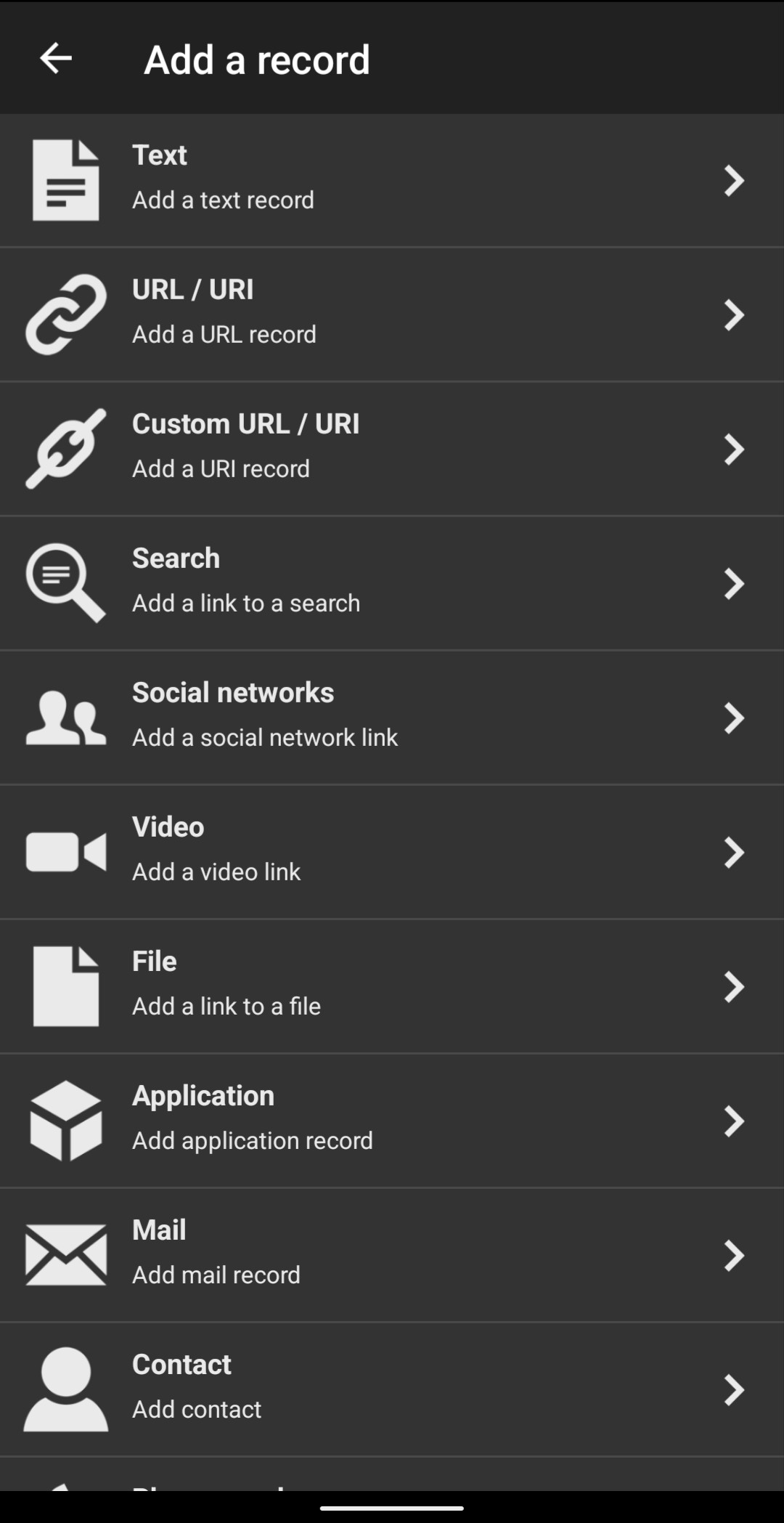
Under the WRITE tab, click Add a record
Click on URL/URI to add the link to your portfolio.
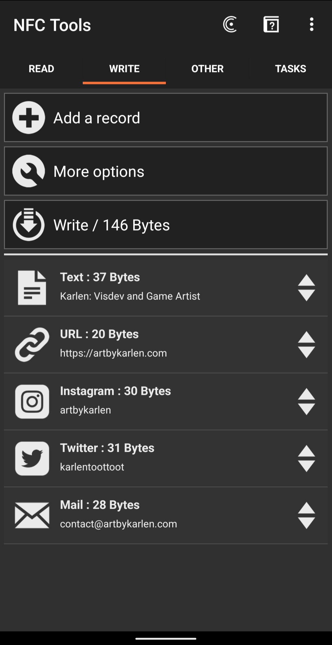
It is possible to add multiple records to our chip (each has 492 bytes of storage), but the first URL record will be the one to open when the chip is scanned. To add more, repeat Add a record for each.
Click Write and hold the charm up to the back of your phone. You may need to move it around a bit to find the scanning spot as some phones have the reader on a different location.
To test, return to the home screen and tap the charm on the back of the phone. We should get a pop-up directing to the URL we’ve added earlier
Tips and Tricks
Some things I’ve discovered while researching and experimenting on the functions I wanted my tags to perform:
lf you get Write Error! Go to the OTHER tab, and do Erase Tag. It also helps to go to the READ tab to scan the tag before trying to write again. Repeat the erase and read as needed, it will eventually work after a couple of tries.
As mentioned in Step 5 of the Instructions, I’ve found that even though the chip can hold multiple records of various types, it will perform whichever is the first. Therefore, if you want to share multiple social media or websites, you may want to use a linktree or similar page.
From my research, Apple and Android behave differently when scanning tags due to each’s security protocol. For example, if you have created a “Contact” record, scanning the tag with an Android will automatically open and save a new contact. But on iOS, you’ll need to jump through a couple more hoops. In most scenarios, your device will open the link using a web browser.
To make use of the ability to hold multiple record types, I found this workaround after hours of experimenting and research (I’m using an Android device so I don’t know if this works on iOS ) The most beneficial aspect of this method is that it opens the social media app to your profile instead of in browser. It isn’t the most elegant because the user has to scan the tag multiple times to access the different records, but was unable to find any info on how to do this anywhere else:
Make the first record a Text type (you can put your name/title/whatever). This bypasses the default action of opening the browser when the tag is scanned.
Add any other records you want. You can use the Social Network and even Mail or Contact, and it should open the relevant app when selected
Here is an example, ready to write
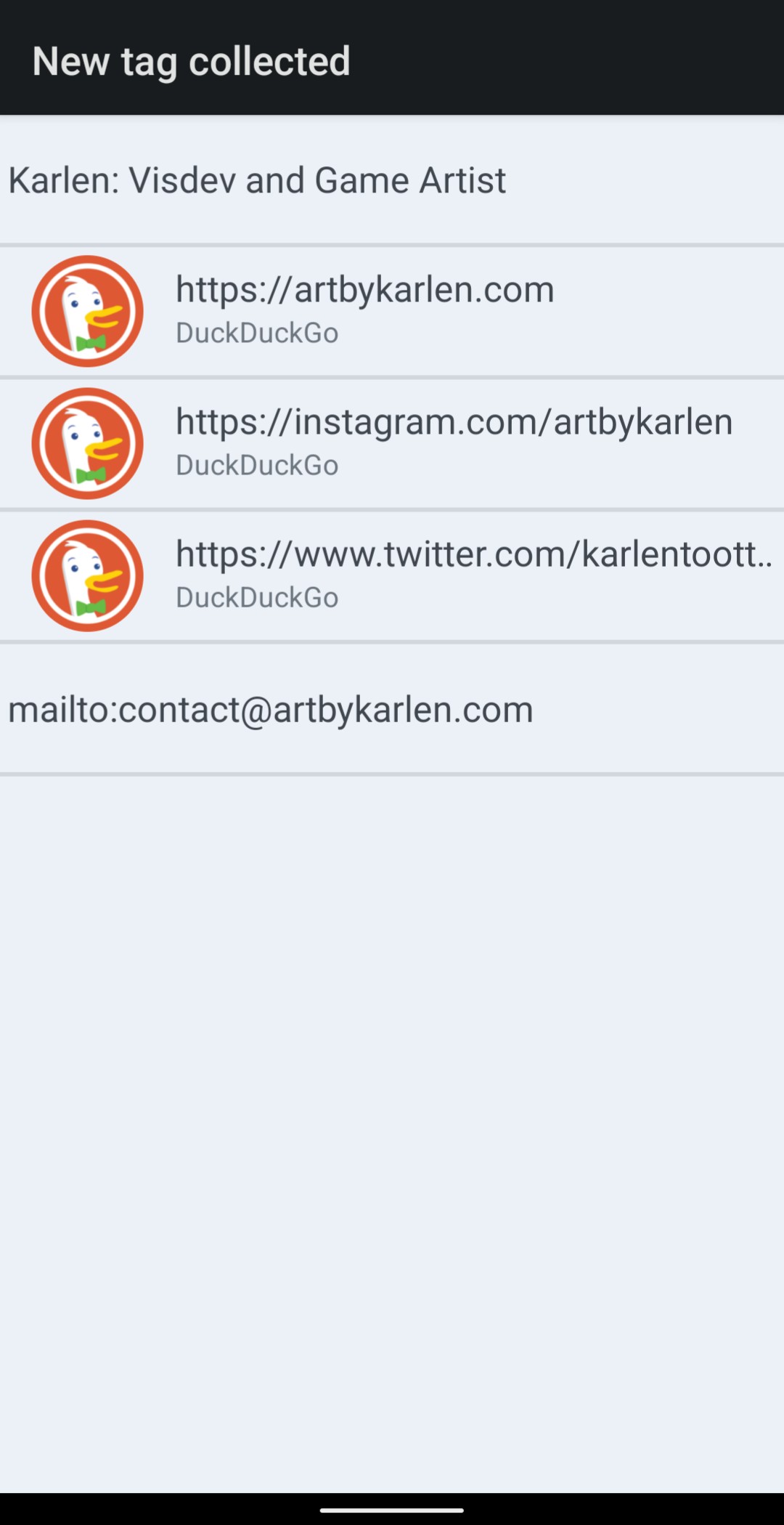
Scanning that tag brings up this screen, and tapping on per each item will take you to appropriate app, as opposed to directing you to a login screen for Twitter or IG. It doesn’t look pretty, but it’s direct!
For the DIY kit: to remove the keyring while you’re decorating, you will need two strong pairs of pliers. I recommend opening it up sideways so that the ring forms a short spiral instead of a C, as that will make it very hard to close. I’d love to see how you’ve decorated it so please feel free to tag or email me!
And that’s it! If you have trouble or make any other discoveries, feel free to leave a comment or email me!